Olive
A medical information, organization, and mental wellness app for breast cancer patients, designed to bring calm to one of the most overwhelming experiences of a person's life.
The Short Version
The Problem
Breast cancer patients are overwhelmed with medical paperwork stored in binders at home, juggling multiple patient portals, and lacking mental wellness support in one place.
My Approach
Surveys → interviews with breast cancer patients → two personas → card sorts → sketches → mid-fidelity prototyping → 6 usability tests → 8 iterations to high-fidelity.
The Outcome
A high-fidelity prototype for a health and wellness app that consolidates medical records, patient portals, and mental wellness tools, designed around what users actually told me they needed.
Problem Statement
Medical records in a binder
on the dresser
Breast cancer patients receive an enormous amount of information at the start of treatment: paperwork, portal logins, provider contacts, medication schedules. Most of it ends up in a binder at home, never to be opened again.
The design challenge: allow health-conscious individuals to log in to a responsive health and wellbeing portal to record their medical information, while also supporting their physical and mental wellness.
"I remember being very, very overwhelmed; it was just so much. I put the binder on my dresser and that's where it stayed."
— Jill, user interview participantThe inspiration came from a close friend who had recently completed her breast cancer treatment. I wanted to learn what people found most frustrating about the medical side of treatment, and design something that would bring ease during an unexpected time in their lives.
My Role & Project Plan
Four months,
end to end
I was the sole UX researcher and designer on this project. The scope was larger than anything I'd tackled before, requiring me to manage a full research pipeline, multiple rounds of testing, and design iterations all the way to high-fidelity.
Research
- User Surveys
- User Interviews
- Persona creation
- User Journeys
- User Flows
Design
- Information Architecture
- Card Sort
- Low-fi Wireframes
- High-fi Prototypes
Evaluation
- Usability Testing
- Preference Testing
- Peer Review
Research & Discovery
Letting users challenge
my assumptions
Surveys first. I wanted quantitative signal before going into depth. My core questions: Do patients struggle to coordinate multiple providers? How do they receive and store medical information? What wellness support did they use during treatment?
41%
Felt frustrated coordinating providers
I had assumed this number would be closer to 70%. My assumption was wrong, and it changed how I weighted the coordination feature.
61%
Chose "better sleep" as their wellness need
I'd assumed physical activity or nutrition would dominate. Sleep was the clear winner, and shaped the wellness section of the app.
76%
Received info via paperwork
82% stored it in folders and binders at home. A lot of critical information sitting inaccessible when patients needed it most.
25%
Saw 7–8 healthcare providers
While 33% saw 3–4. Even at the lower end, that's a lot of portals, appointments, and paperwork to manage simultaneously.
Then, interviews. I conducted four remote interviews with women who had undergone breast cancer treatment, to see if they aligned with the survey results, and to go deeper on the human experience behind the numbers.
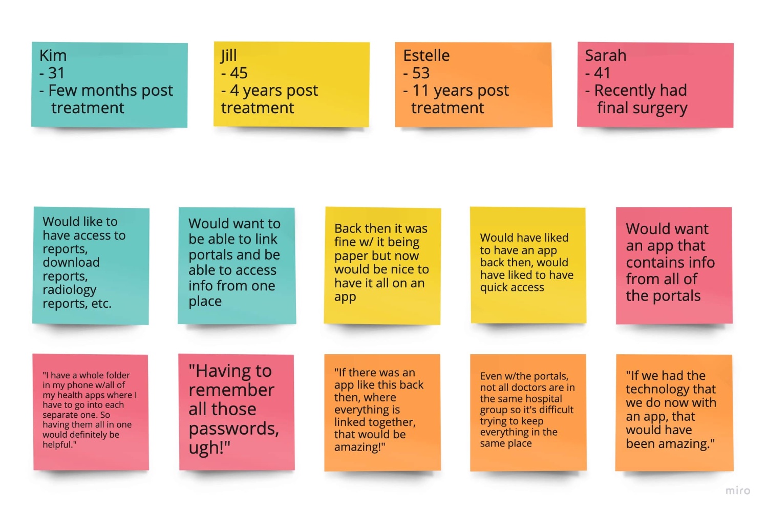
Key interview findings:
- All four participants mentioned receiving a lot of information through paperwork stored in binders or folders at home, confirming the survey data.
- Every participant was frustrated by juggling multiple patient portals, and all said it would make their lives easier if the information lived in one place.
- Because paperwork stayed home, most women relied on Google while out and about, a risky and unreliable workaround for medical information.
Insights & Personas
Designing for Christine
and Abby
Based on the four interviews, I created two personas, Christine and Abby, each representing distinct needs and contexts within the same target audience. Keeping them in mind grounded every design decision that followed.
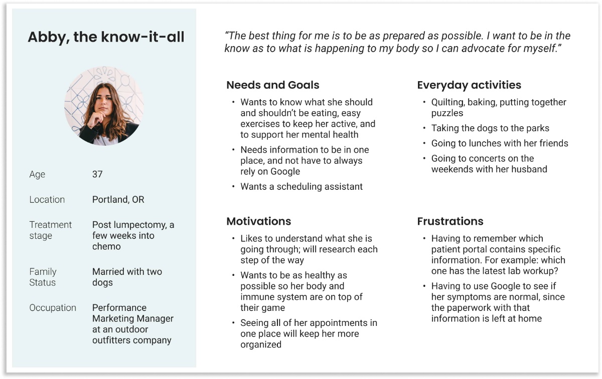
Abby, the know-it-all
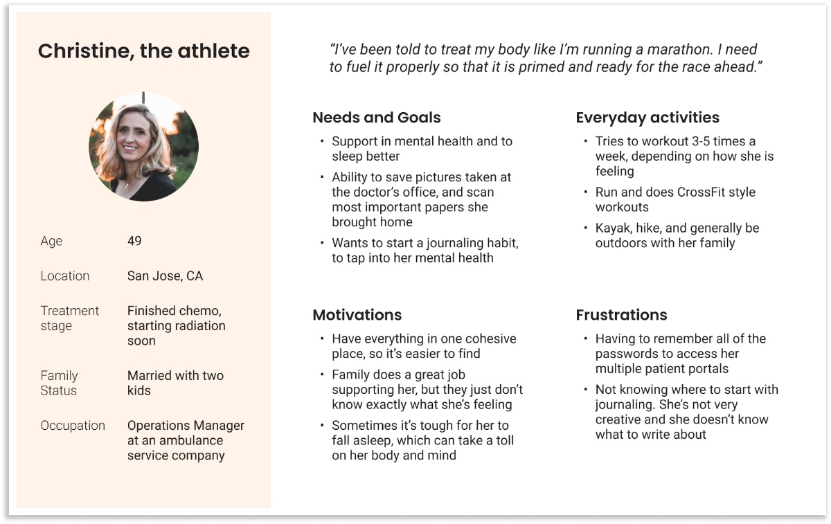
Christine, the athlete
Ideation & Explorations
From architecture
to screens
User flows. Before touching screen design, I mapped out how Christine and Abby would reach their goals through the simplest and most direct path, helping me build a working architecture without wasting time on mockups that wouldn't hold up.
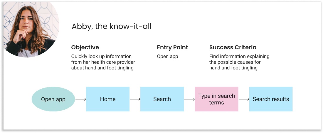
Abby · Smart Search
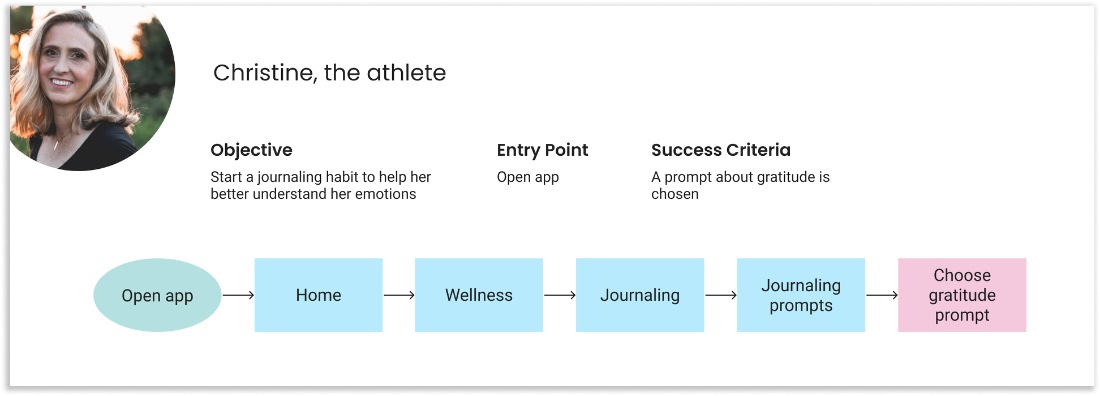
Christine · Journaling
Card sort & sitemap. Rather than build on my own assumptions about information architecture, I ran two unmoderated virtual card sorts. The results corrected several placements: most notably, scanning/uploading features that I had on the home page got moved to a dedicated "Stay Organized" section, which participants created themselves.
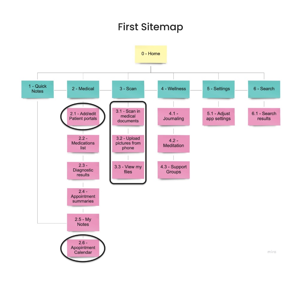
Before Card Sort
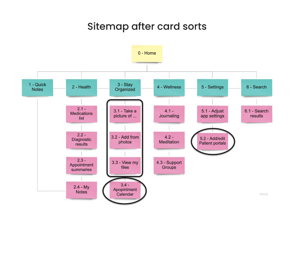
After Card Sort
Sketches. I used GoodNotes on my iPad to hand-draw each screen in Christine and Abby's flows, a fast, low-guilt way to draft the design before committing to a digital tool.
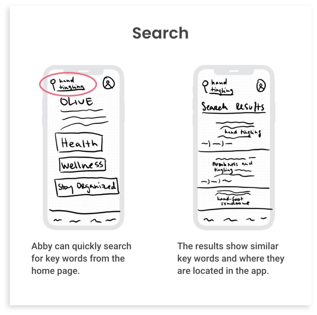
Abby · Smart Search
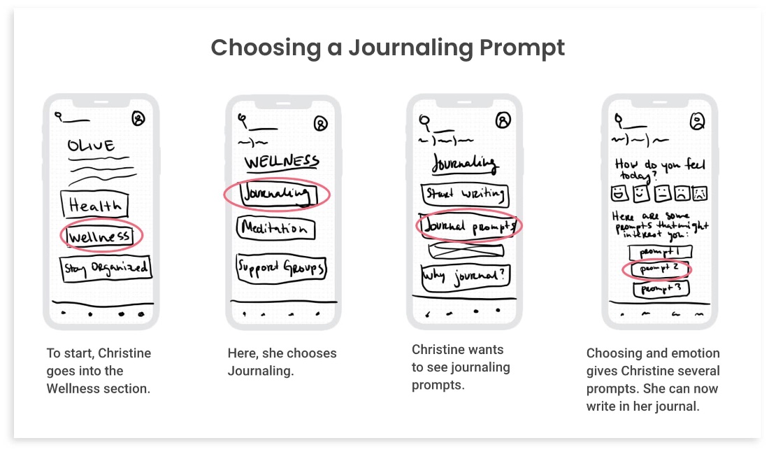
Christine · Journaling
Usability Testing & Final Design
Eight iterations
to get it right
With a mid-fidelity prototype built in Adobe XD, I conducted six moderated remote usability tests with women who have or had breast cancer. Three key findings shaped the revisions:
- Assumptions were tested: All participants had trouble finding some features on the first try, but once they found them, placement made sense. A discoverability problem, not a structure problem.
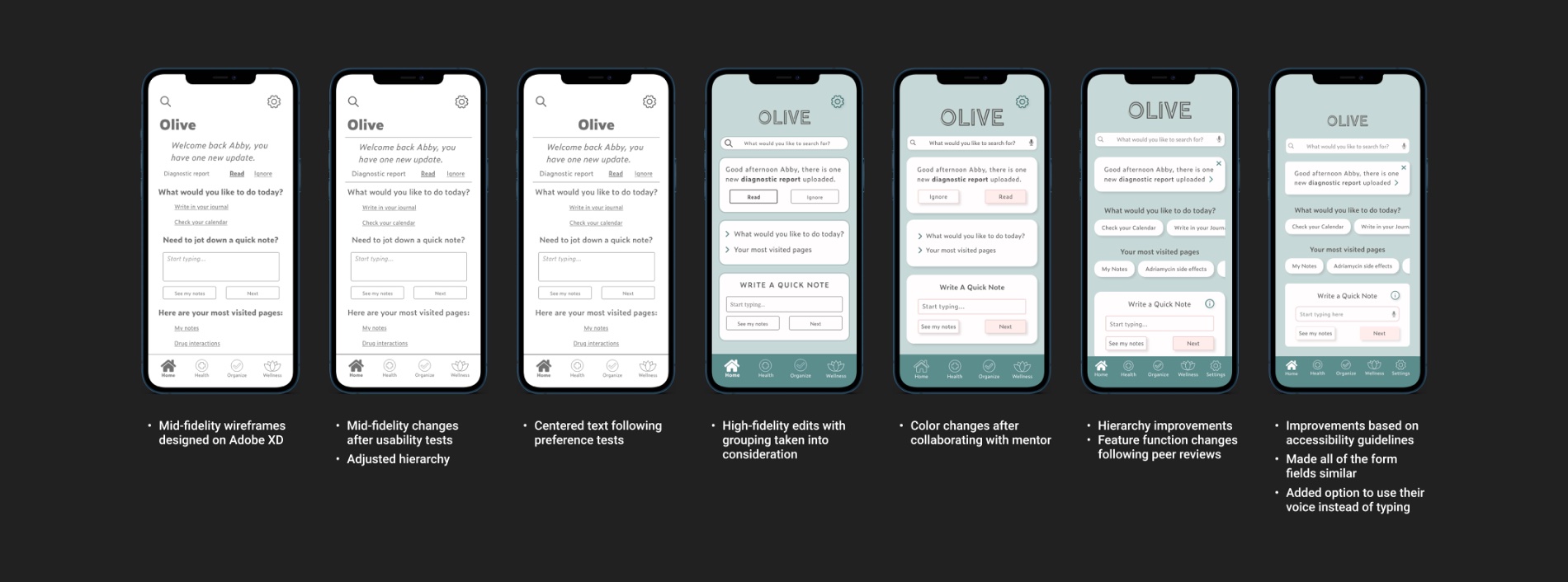
- Hierarchy was unclear: Lack of visual hierarchy caused participants to overlook key sections. This drove a major round of layout revisions.
- Personality varies: Three participants kept exploring after tasks were done. Two needed prompting to vocalize. Designing for focused and exploratory users simultaneously was a real challenge.
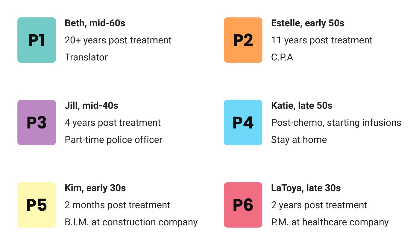
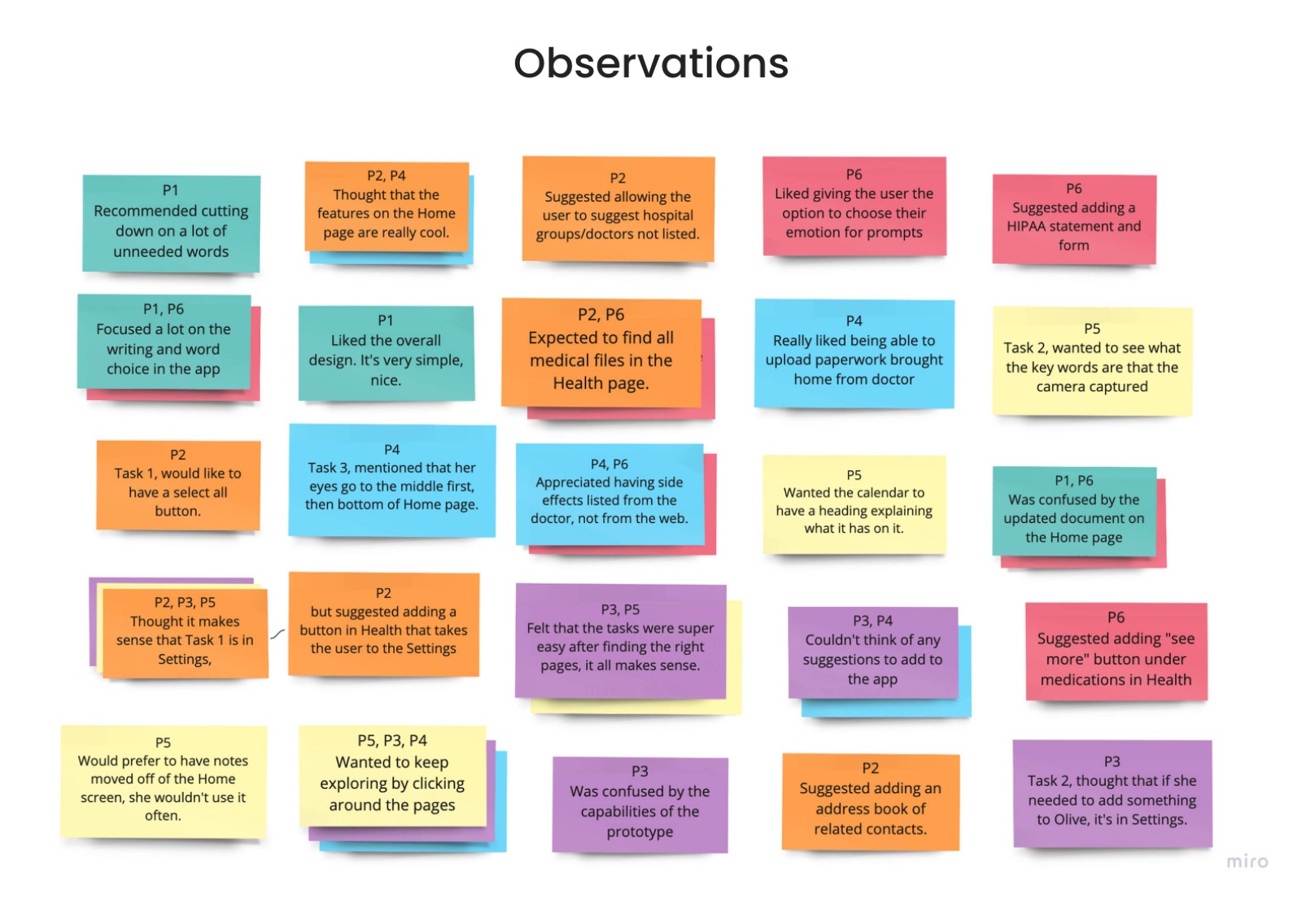
Following testing, I ran preference tests, gathered peer reviews from three UX designers, and iterated through eight versions total. Some of the most useful feedback:
“
Megan, UX Designer
"The bottom nav icons can be made about 25% smaller. They are important but are too prominent and don't need to be so 'loud' at all times."
“
Karina, UX Designer
"The features seem important for the target group. It gives a feeling of organization and health, but no sickness. I think this is a very strong point of your app."
Following testing, I iterated through eight versions in total, refining hierarchy, color, and copy at each step:
UI Design & Color
Choosing a color scheme for Olive came down to one question: should I use the bright pink associated with breast cancer awareness, or not? I decided it wasn't my choice to make, so I asked users. In a survey conducted in a breast cancer forum, 62% said they found bright pink "overplayed" in products made for them. I used light pink only as a subtle accent.
Green was chosen as the primary color, evoking health and tranquility. The goal was to create a space that felt pleasant and welcoming, not clinical or sad.
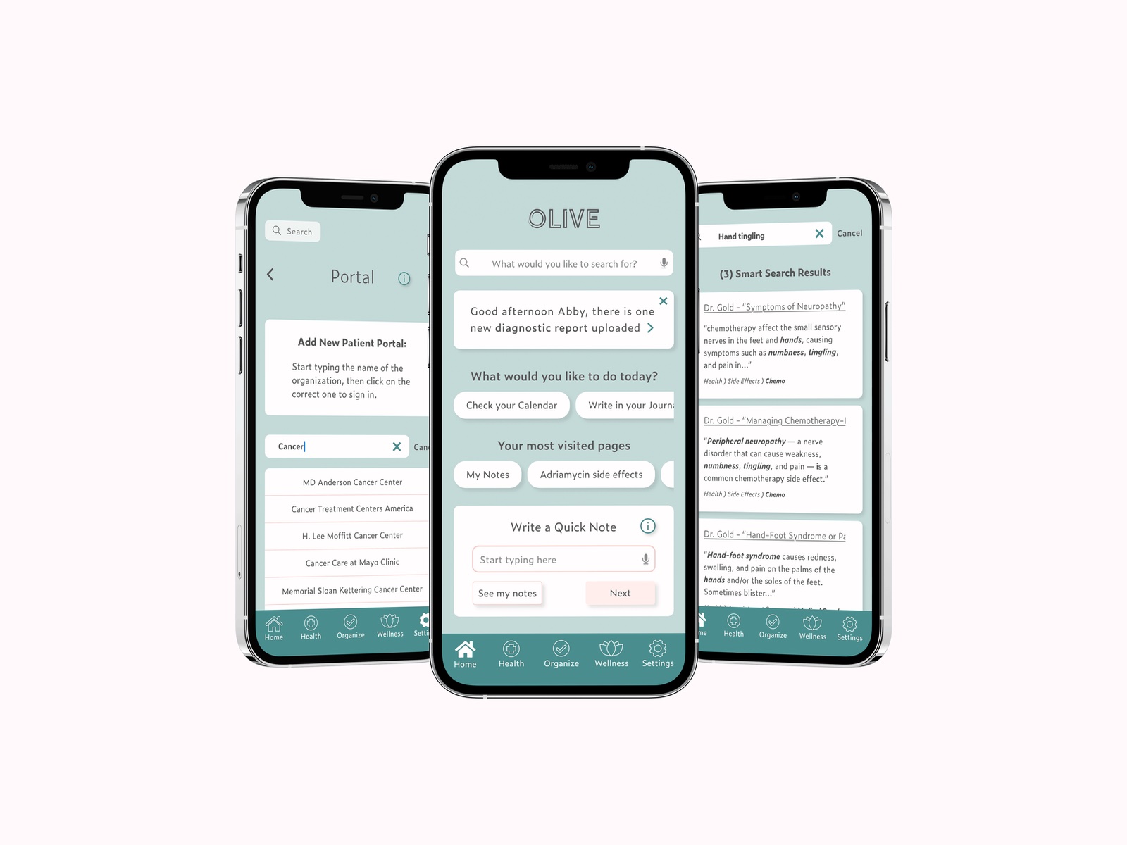
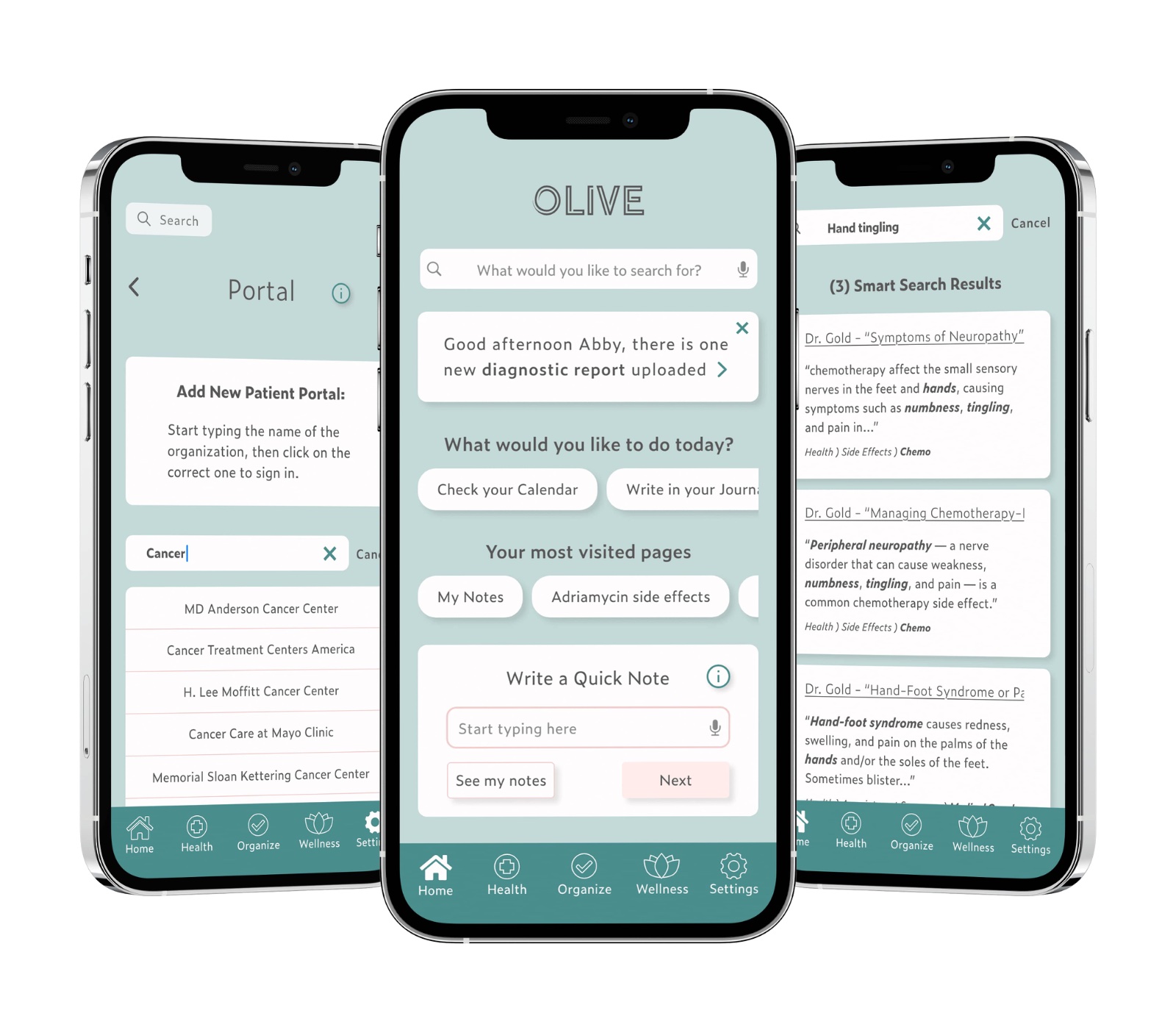
The final prototype includes three key flows: adding information from an existing patient portal, Christine's journaling with gratitude prompts, and Abby's Smart Search for side effect information.
Reflection & Learnings
Listen to the research
and it'll take you far
Authentic research requires real effort to findFinding women with breast cancer who were willing to discuss their experience was genuinely hard: some didn't want to be "guinea pigs," for others the memories were too painful. I was grateful to participants who reached out to their networks on my behalf. The integrity of the project depended on it.
Accessibility belongs at the forefront, not as an afterthoughtBreast cancer doesn't discriminate, and neither does Olive. I learned to make accessibility decisions (form field consistency, voice input, color contrast) from the very beginning of the design process, not as a final pass.
The design thinking process builds confidenceFollowing the full process gave me confidence that Olive is a respectful and useful solution, not just a product I assumed people needed, but one I tested, challenged, and iterated based on what real users told me.
Next Steps