Perfect
Properties
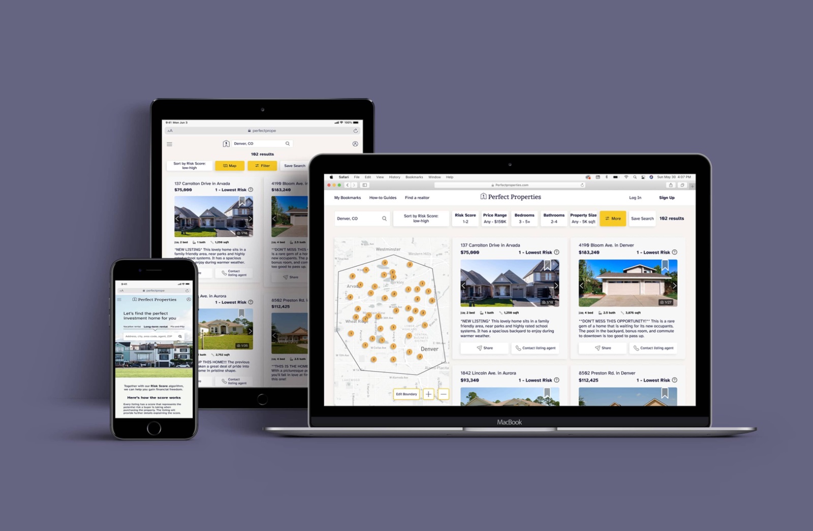
A responsive web app that helps investment property buyers assess risk and find the right property, so they can make smarter financial decisions faster.
The Short Version
The Problem
Real estate sites like Zillow and Trulia don't serve investment property buyers. They still have to do all their own risk research outside the platform.
My Approach
Competitive analysis → user flow → iPad sketches → two rounds of usability testing → preference testing → low-fi to high-fi in Figma → responsive breakpoints.
The Outcome
A high-fidelity responsive prototype that uses an MLS-data algorithm to show investment property risk scores, across fix-and-flip, vacation rental, and long-term rental types.
Problem Statement
The gap no real estate
website is filling
The brief: design a responsive web app that provides property buyers with the information they need to make smart investment decisions. My goal was to go further: to build a tool that actually does the work for the user, so they can focus on choosing the right property rather than researching it themselves.
I started with a competitive analysis of Zillow, Realtor.com, and Trulia, studying their strengths, pain points, and missed opportunities. The core finding: none of them offer information specific to investment properties. A user who goes to these sites hoping to find their ideal investment property still has to do all their own risk research elsewhere.
"None of those websites offer information relating to investment properties. This opened the door for me to design a solution that did the work for the user."
My design goal: don't disrupt users' existing mental models (they already know how real estate sites work), but add a layer of investment-specific intelligence that the market is missing.
My Role & Target User
Designing for
Rashida
I was the sole UX researcher and designer on this project, responsible for the full process from competitive analysis through high-fidelity responsive design.
The primary persona was Rashida, an IT consultant who wants to invest in her first property to increase financial security for her family. She's always on the go, makes decisions fast, and needs relevant information without noise or wasted time.
Research
- Competitive Analysis
- User Flow
- Surveys
Design
- iPad Sketches
- Low-fi Wireframes
- High-fi Prototype
- Style Guide
- Responsive Breakpoints
Evaluation
- Usability Test #1
- Preference Testing
- Usability Test #2
Ideation & Explorations
User flow first,
screens second
User flow. Before sketching a single screen, I mapped out every step Rashida would take to contact a property's listing agent. My goal: make the path as seamless and direct as possible, with no unnecessary decisions along the way.

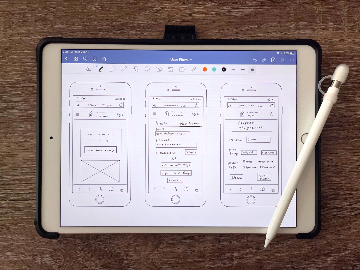
Sketches. Drawing inspiration from the competitive analysis, I sketched each screen of the user flow on my iPad in GoodNotes: fast, low-detail, focused on structure not finish. I also began thinking through how to visually highlight properties that best matched the user's criteria.
Usability Test · Round 1
Testing early,
correcting fast
After building the first wireframes, I tested them immediately, before investing time in fidelity. Three issues stood out clearly:
01
The bookmark button was confusing
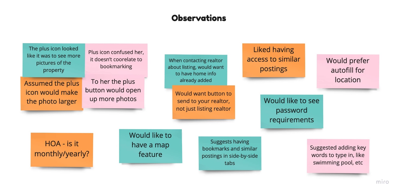
Participants interpreted the + icon as "see more photos" or "zoom in", not save. A critical error. I ran a preference test afterward: 70% of participants preferred the classic bookmark icon. Changed immediately.
02
Map feature was missing
Participants noted the absence of a map, a feature they expected from any real estate product. I had overlooked it entirely. Adding it was non-negotiable.
03
Participants wanted more options
Examples: seeing HOA fees at yearly or monthly rates, and being able to send a property to their own realtor (not just contact the listing agent). Flexibility matters.
Wireframes & Visual Design
From structure
to color to insight
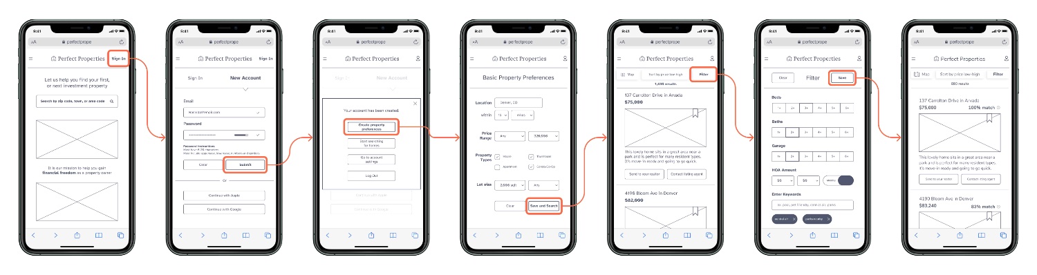
Low-fidelity. I moved the revised sketches into Figma, focusing purely on flow and structure: no color, no fine detail. After creating an account, users set basic preferences to see selected properties, then apply specific filters. Each listing shows how closely it matches their criteria.
The "aha" moment. While watching a home renovation show, I realized that different investment property types (fix-and-flips, vacation rentals, long-term rentals) each carry their own risk profile and deserve their own visual identity. I collaborated with my mentor to develop this concept, then ran a survey to find out what colors participants associated with each type:
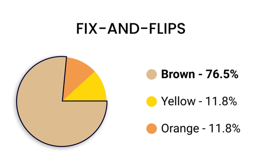
Fix-and-Flip · Brown
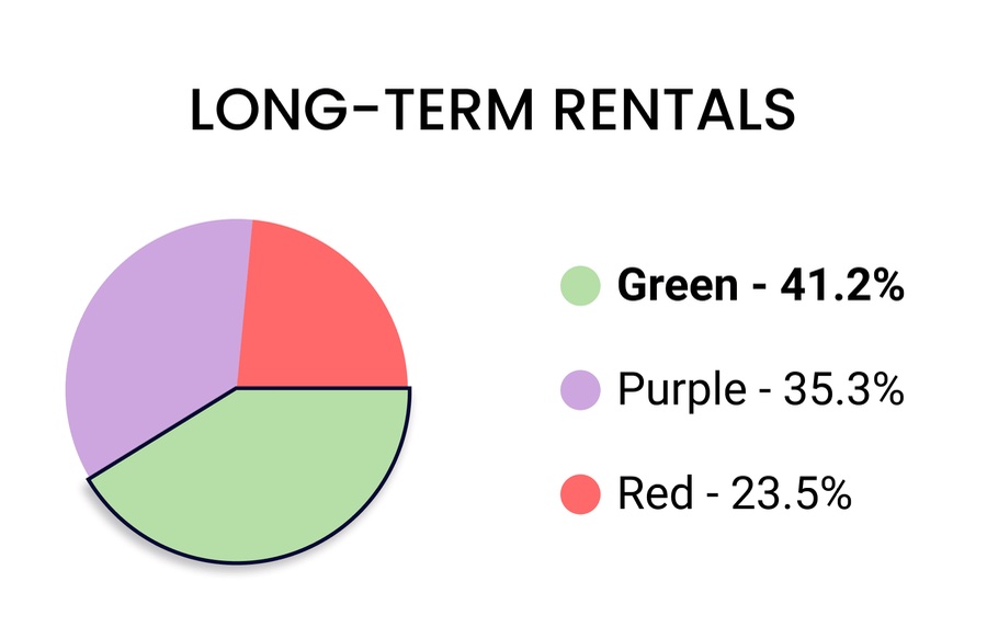
Long-Term · Green
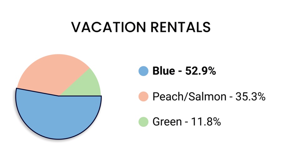
Vacation · Blue
The survey results shaped the high-fidelity color system. I chose tan, blue, and green, which align on the square color scheme per the Color Harmony Rule, and kept the original yellow as the main accent. I also updated the user flow: account creation now happens only when a user wants to save a bookmark, not at the very start.
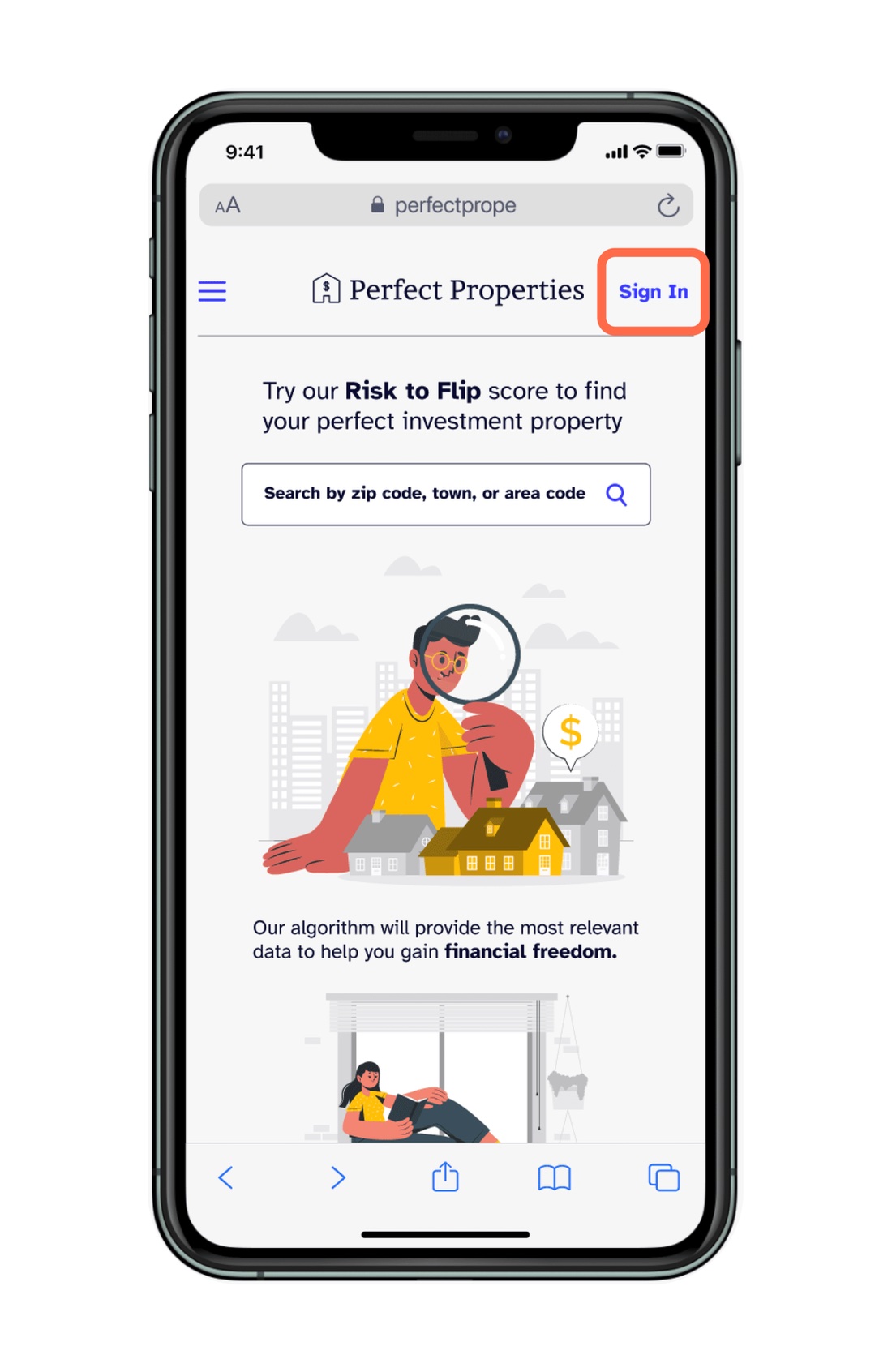
Mid-Fidelity
High-Fidelity
Usability Test · Round 2
Testing again
before shipping
With the high-fidelity prototype built, I ran a second round of usability tests with young professional adults familiar with real estate websites. One participant was actively searching for an investment property. Tests were conducted remotely via Zoom using the Figma prototype link.
01
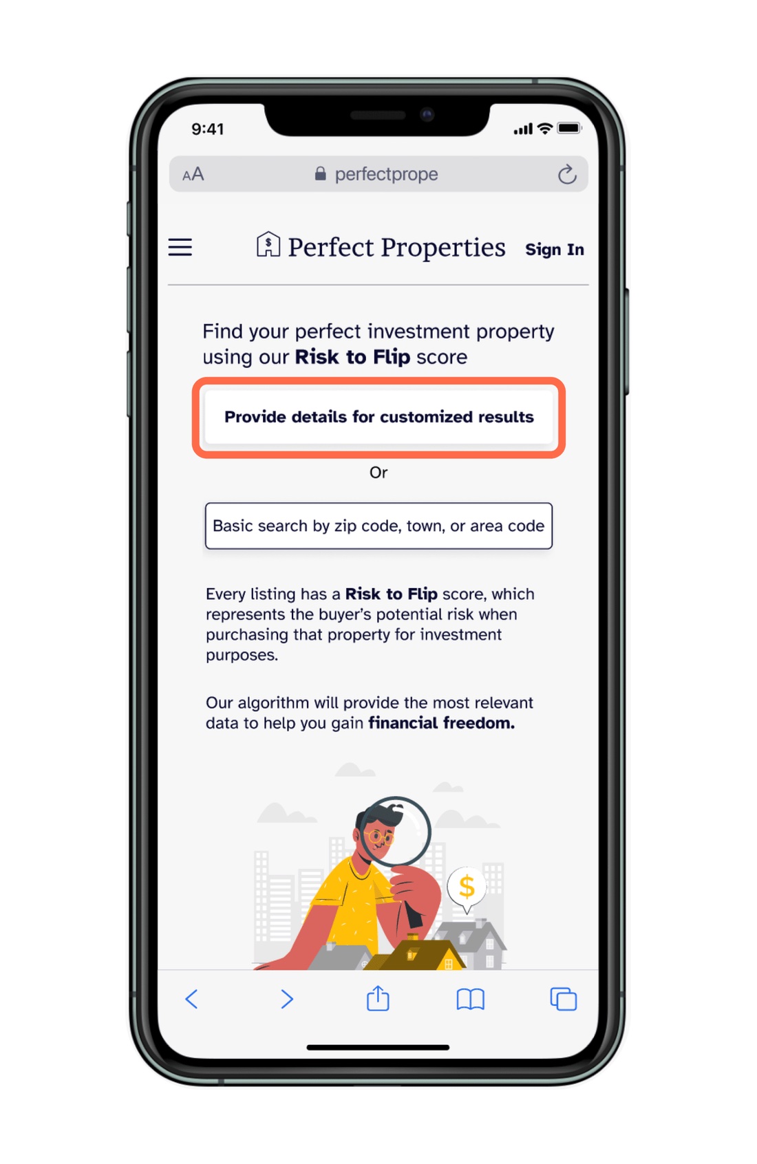
Landing page broke mental models
Participants were thrown off by having to choose between a basic search and providing extra details. It didn't look like a "classic" landing page, which confused their expectations.
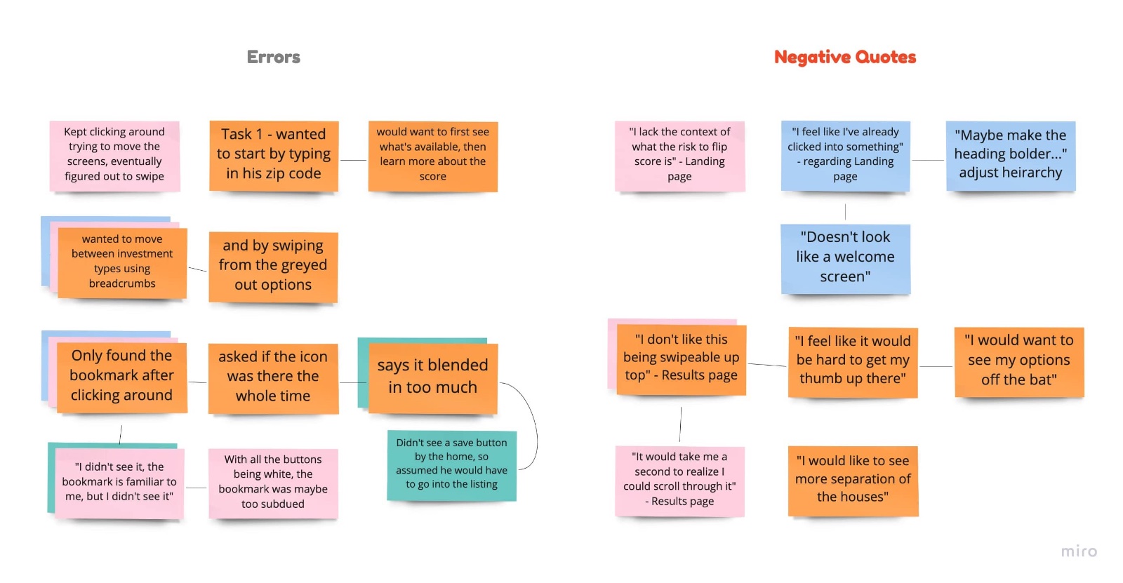
02
Scroll was a pain point
Many participants struggled to discover scrolling, or didn't realize it was possible. A source of real frustration. Fixed by replacing scroll bars with floating action buttons.
03
Bookmark icon still unresolved
Despite the preference test update, almost all participants still struggled to find the bookmark icon. I redesigned the results page using the principle of proximity, grouping all property details within a card, with the bookmark clearly visible.
After the second round of revisions I created a full style guide in Figma documenting the design system for all stakeholders: typography, color, components, and usage rules.
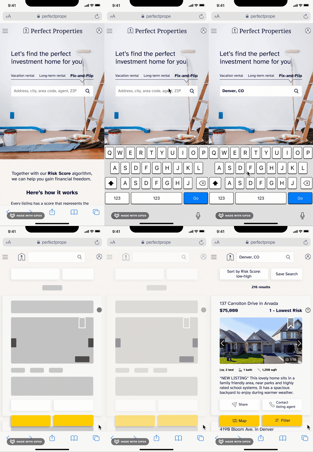
Landing Page
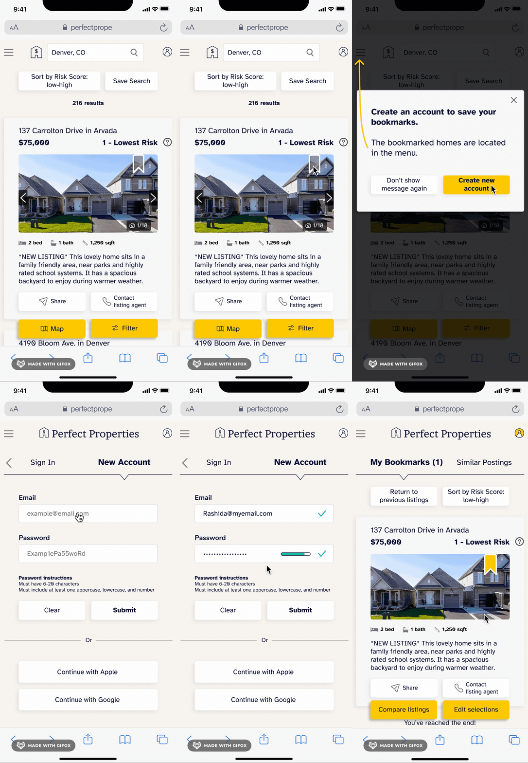
Bookmarking
Responsive Design
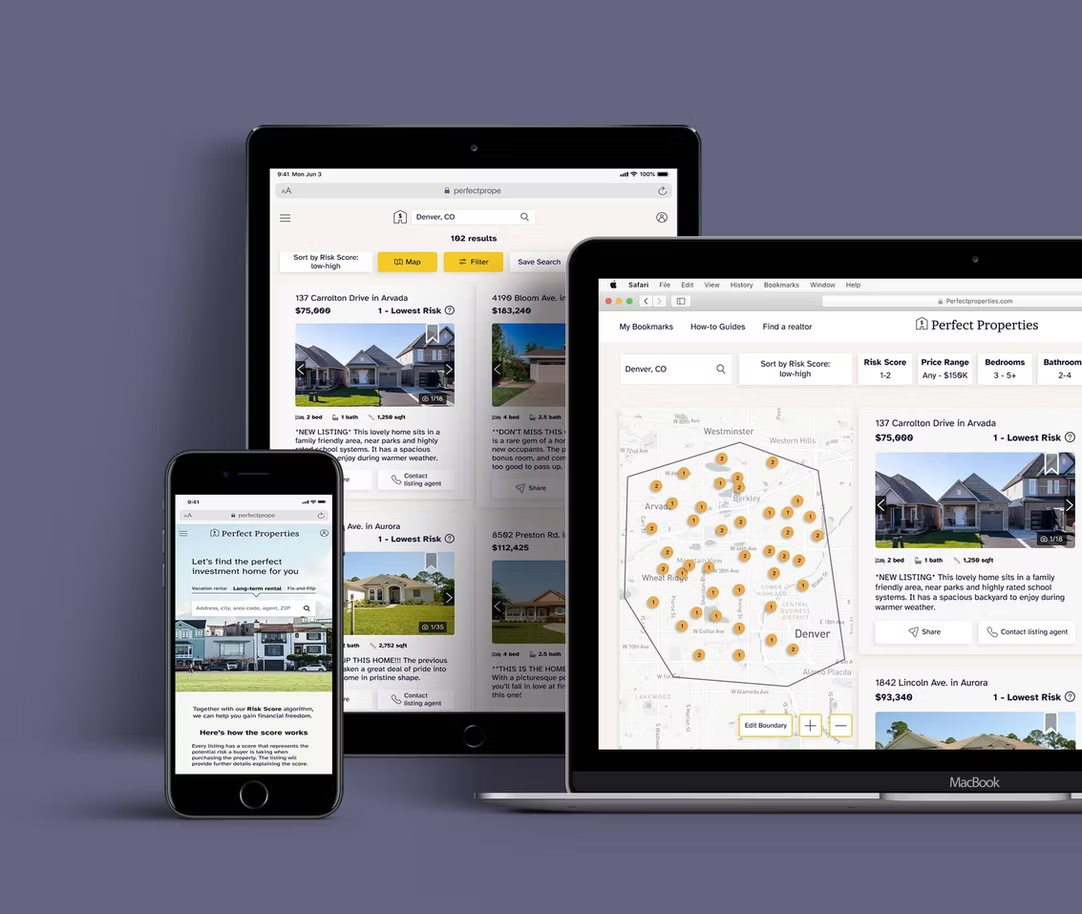
I approached this project with mobile-first design by way of progressive enhancement: a baseline of features on mobile that evolves at tablet and desktop breakpoints. Working through the larger breakpoints surfaced layout challenges: the 12-column grid required careful margin and gutter adjustments so buttons weren't too long on desktop or too short on tablet, and landing page graphics needed repositioning at each size.
Reflection & Learnings
Testing is the only way
to know if it works
My assumptions were challenged at every stepWithout two rounds of usability testing, Perfect Properties would likely be abandoned by users like Rashida. The bookmark confusion alone, persisting through a preference test and into a second round, taught me that testing once is rarely enough.
Existing mental models are powerfulUsers arrive with expectations shaped by Zillow and Realtor.com. Departing too far from those patterns, even in service of a better idea, creates friction. I learned to innovate within the familiar, not against it.
The concept resonated stronglySeveral testers mentioned they were personally interested in buying an investment property, and that they liked knowing the risk score upfront. That reaction reinforced my belief that Perfect Properties fills a real gap in the market.
Next Steps
A viable product
waiting to be built
There is currently no real estate product aimed specifically at investment property buyers. I believe Perfect Properties could fill that void.