BowFlex T6
Treadmill Console
Designing the console faceplate for the first true BowFlex treadmill under Johnson Health Tech, defining a new direction for BowFlex home fitness equipment.
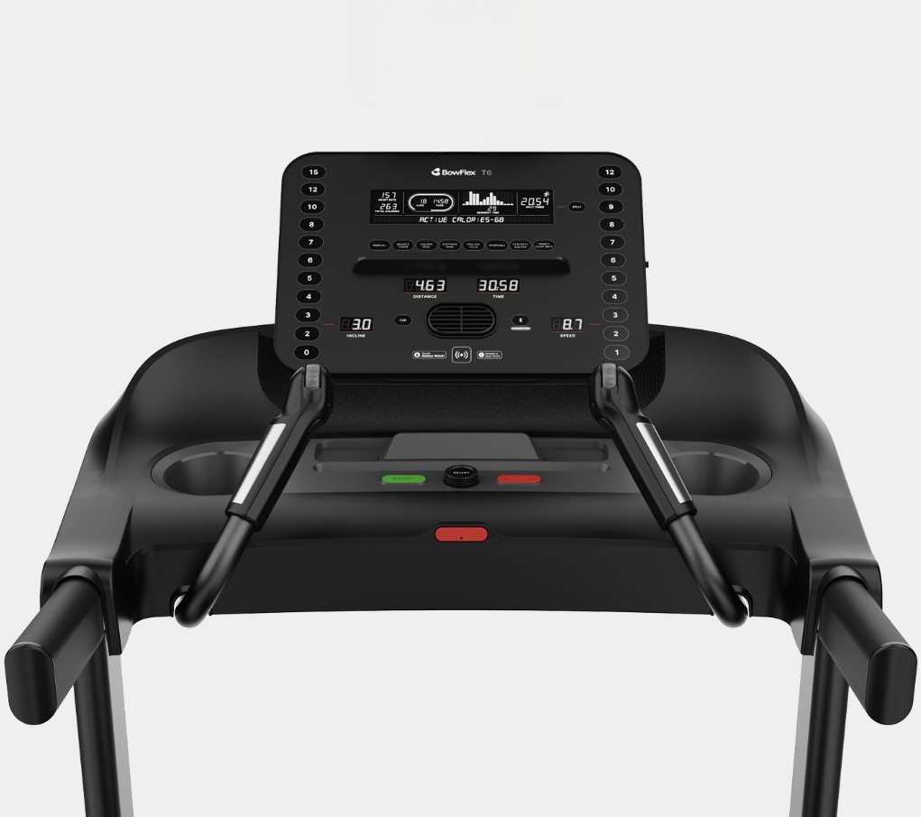
The Short Version
The Challenge
Design the console faceplate for the first BowFlex treadmill under Johnson Health Tech, setting a new visual direction for the brand while working within the constraints of LED display windows.
My Approach
Competitive analysis → whiteboard sketching with sticky notes → close collaboration with industrial designers → iterative stakeholder reviews until consensus was reached.
The Outcome
A shipped product, available at BowFlex.com and Dick's Sporting Goods, with broadly positive customer feedback on the console design and usability.
Context & Challenge
A new chapter
for BowFlex
After Johnson Health Tech acquired BowFlex following its bankruptcy, this treadmill was the first true BowFlex product developed under new ownership. That meant more than just shipping a treadmill. It meant beginning to define what BowFlex home fitness equipment could look and feel like under a new direction.
My focus was the console faceplate: the primary user interface of the machine. Every interaction a user has during a workout (checking speed, adjusting incline, tracking distance) happens here. Getting it right mattered.
"The console had to show all the most important metrics in a layout that made sense, was easy to use, and had a clean and modern look, while working within the constraints of LED display windows."
A key technical constraint shaped the entire design: the console uses LED windows rather than a touchscreen. This meant every metric, label, and control had to be thoughtfully placed at a physical level. There was no flexibility to reorder things in software after the fact.
My Role & Team
UX meets
industrial design
I collaborated closely with one lead industrial designer, with broader team support and feedback throughout. The dynamic was genuinely collaborative: all perspectives were valued and incorporated. My ownership was the console faceplate: metric layout, visual hierarchy, quick-key placement, and the overall user experience of interacting with the machine mid-workout.
Working at the intersection of UX and industrial design taught me a lot about the constraints that come with physical products: decisions are harder to reverse, manufacturing tolerances matter, and the user experience is inseparable from the physical object itself.
Research
- Competitive Analysis
- Price-point benchmarking
- Metric prioritization
Design
- Whiteboard sketching
- Sticky-note layout exploration
- Wireframe iterations
- High-fidelity mockups
Collaboration
- ID team reviews
- Stakeholder presentations
- Iterative feedback cycles
- Consensus building
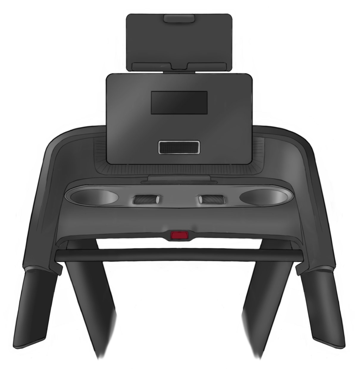
Early on, the industrial designer shared this rendering of the machine: the physical form the console would live in. It became the visual north star for the whole faceplate: the proportions, the tablet mount, the LED window placement, and the quick-key zones all took their cues from it.
Research & Discovery
Knowing the
competitive landscape
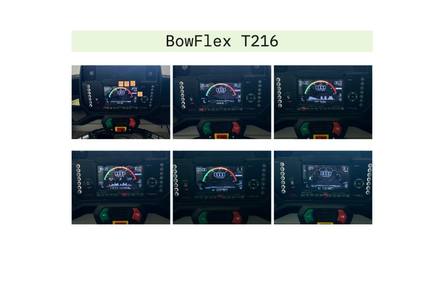
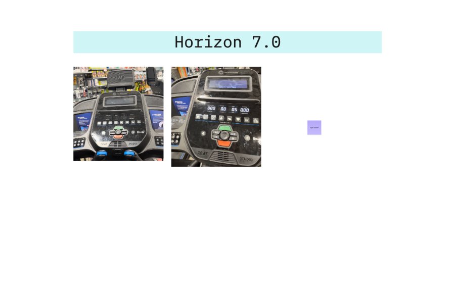
Before touching the design, I conducted a competitive analysis of treadmills at a similar price point, studying what metrics competitors displayed, how they organized them, what their consoles looked like, and where they fell short. This gave me a clear sense of category conventions to respect, and gaps to improve on.
Key observations from the competitive analysis:
- Most consoles at this price point prioritize speed and incline above everything else, confirming user mental models going in.
- Metric layouts are often cluttered or inconsistently sized, making it hard to read at a glance mid-workout.
- Quick-key controls for speed and incline vary widely: placement and size are rarely optimized for use while running.
- Visual design tends toward either overly sporty or purely utilitarian. There was room for a cleaner, more considered aesthetic.
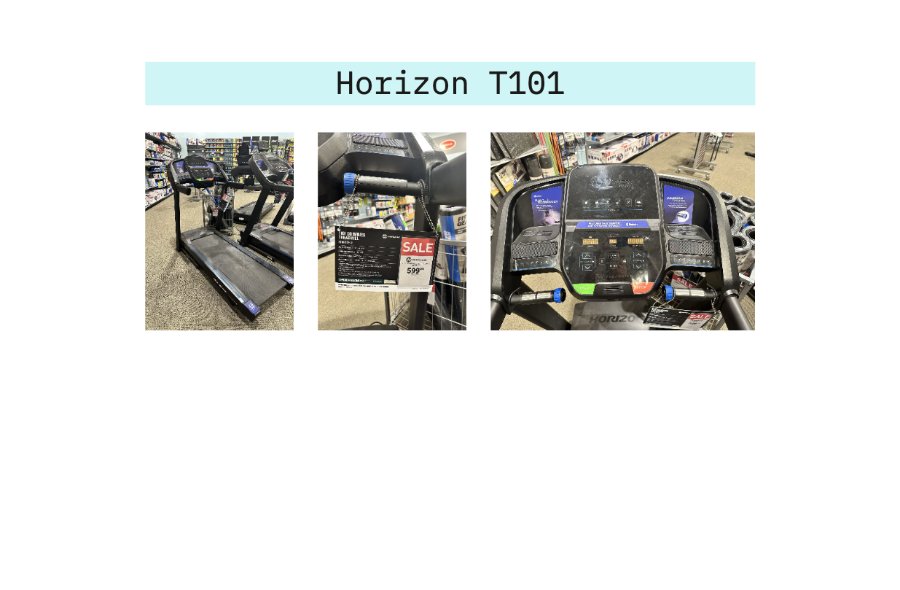
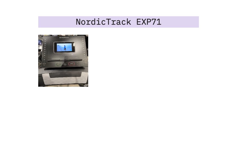
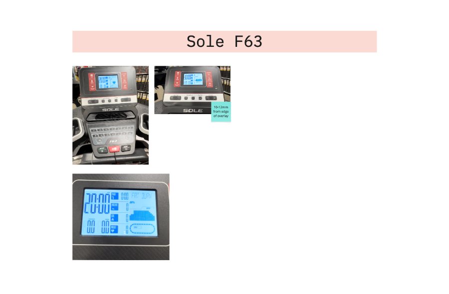
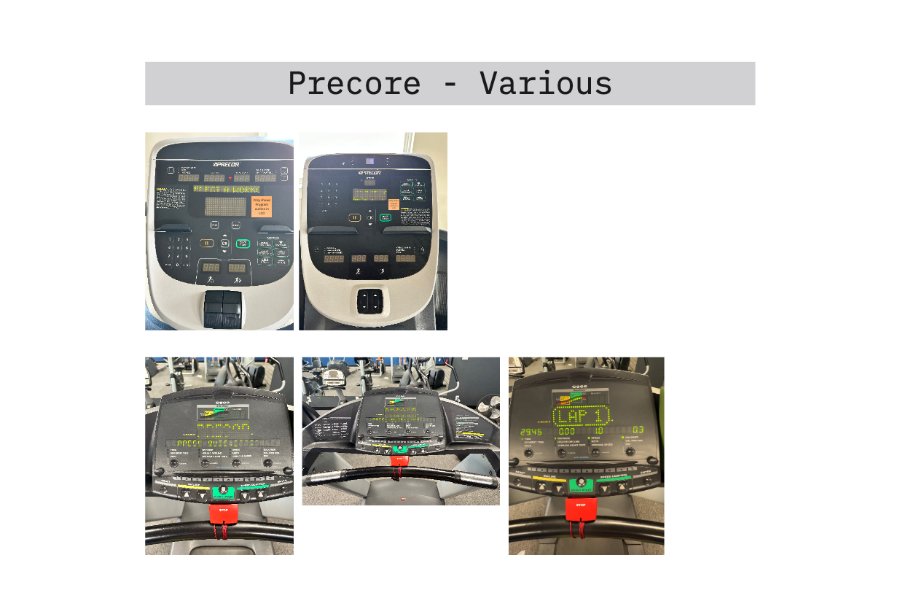
Metric Hierarchy
What matters most
mid-workout
The console needed to display a rich set of metrics. The design challenge was organizing them into a clear hierarchy, so users could glance at what mattered most without hunting for it. I sorted every metric into two tiers: primary (read constantly mid-workout) and secondary (useful, but checked less often).
Primary
Speed & Incline
The two most actively adjusted metrics during a workout. Need to be immediately readable and paired with easy quick-key controls. Users shouldn't have to look away from their form.
Primary
Distance & Time
The two most important progress metrics. Users check these constantly to gauge effort and set mental milestones. Large, clear display is essential.
Secondary
Heart Rate & Calories
Important for health-conscious users but checked less frequently than speed/distance. Positioned prominently but secondary in visual weight.
Secondary
Pace, Track & Brickyard
Pace, laps on a track, segment time, and split time for performance-focused users. Grouped logically together. These tell the story of a workout in progress.
Ideation & Explorations
Sticky notes on
a whiteboard
My ideation process was deliberately physical: I went to the whiteboard with sticky notes representing each metric and started moving them around. Sticky notes let me reposition elements quickly without commitment, trying different groupings and hierarchies until the layout started to feel logical.
The guiding principle: group metrics by their relationship to each other, not just by importance. Speed and incline live together because they're both actively controlled. Distance and time live together because they measure overall progress. Pace belongs near both. It's the relationship between the two.
These early explorations were shared with the industrial design team and stakeholders for feedback. The collaboration was genuinely iterative: ideas were challenged, improved, and built on. Every round of feedback sharpened the layout.
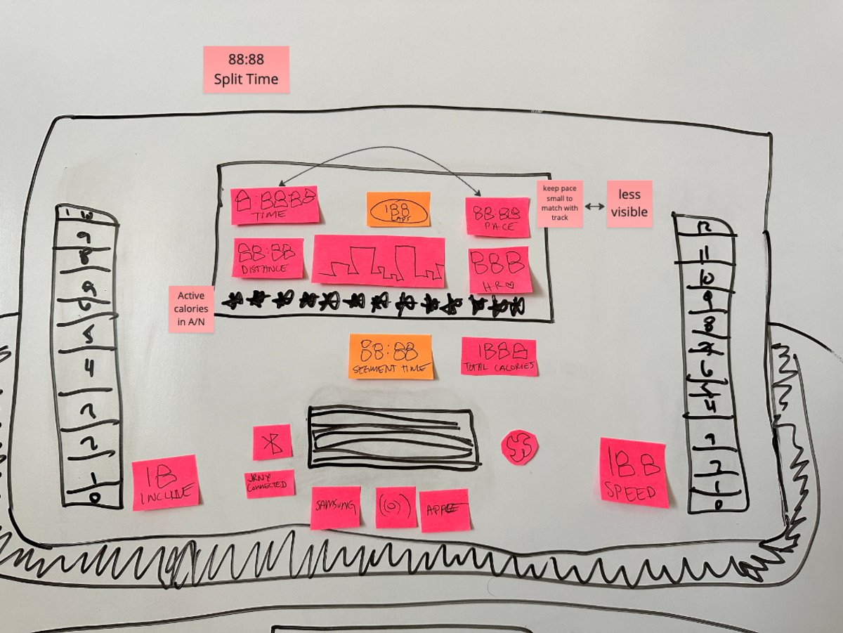
Iteration 1
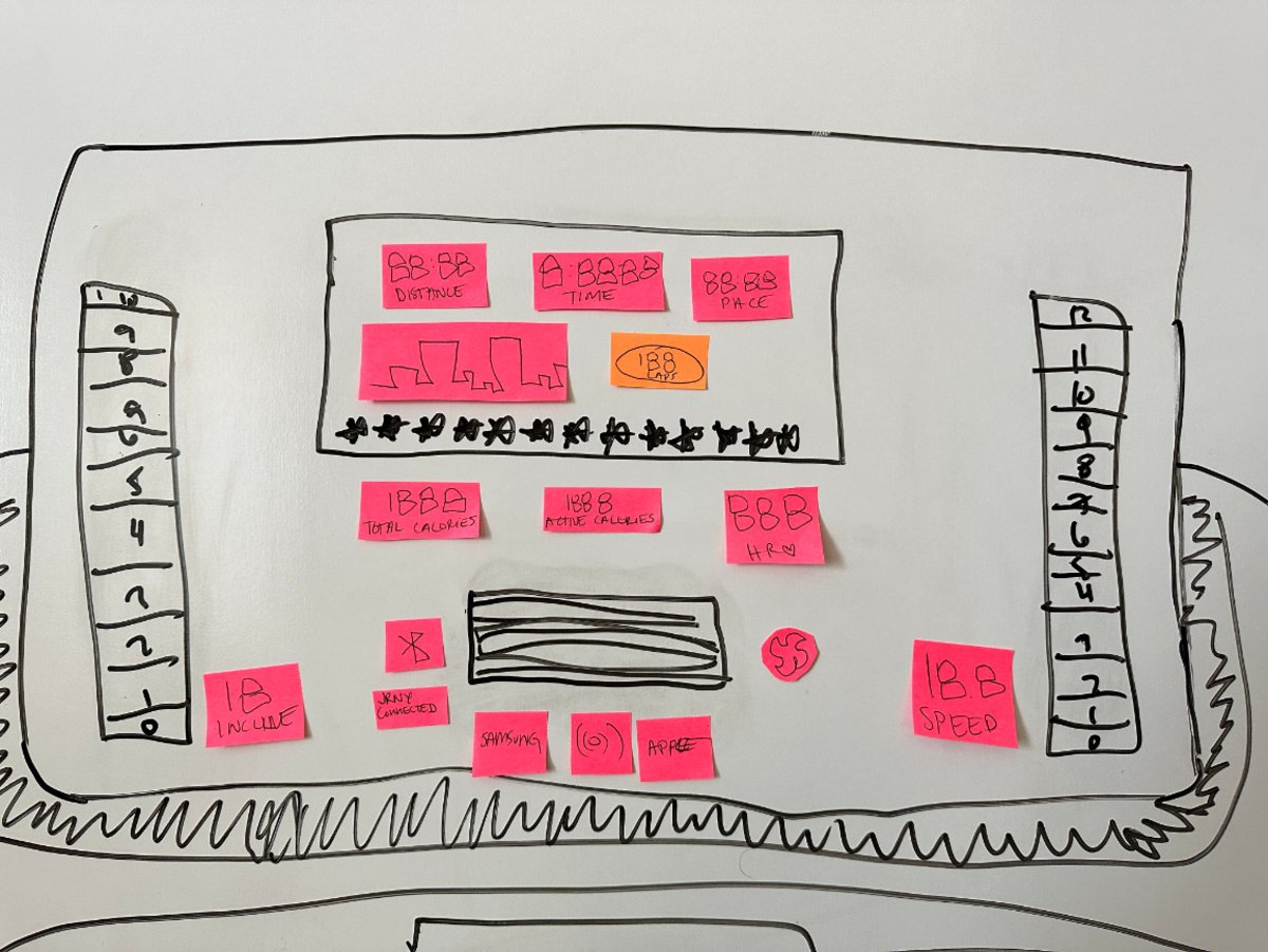
Iteration 2
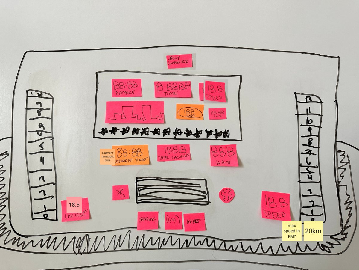
Iteration 3
Final Design
Clean, modern,
and shipped
The final console faceplate reflects the full process: competitive research, layout exploration, and rounds of collaborative iteration. The result is a design that feels clean and modern while being genuinely usable mid-workout.
The LED window constraint, rather than being a limitation, became a discipline: every element had to earn its place. The layout communicates hierarchy through size and position alone: no color, no animation, no touchscreen shortcuts.
High-Fidelity Iterations
Working in Illustrator, I iterated on the faceplate across many rounds, refining the display grouping, the LED window shape, quick-key placement, and the balance between the screen and the physical controls.
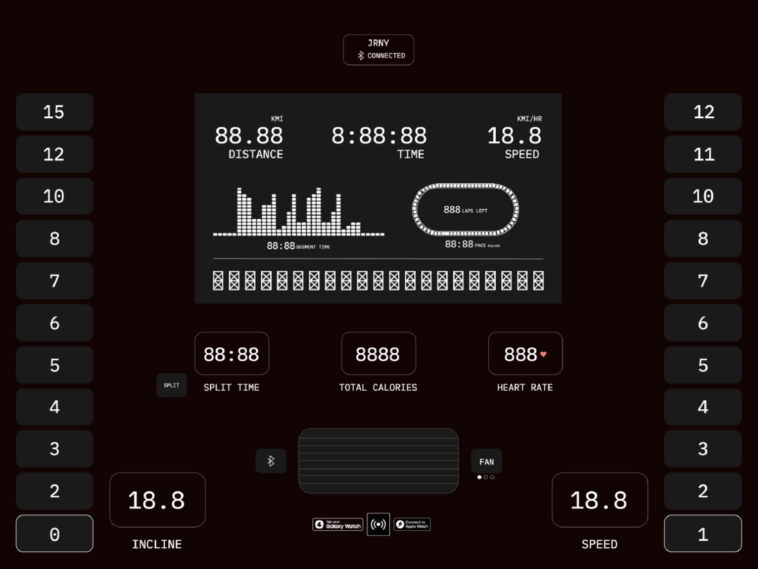
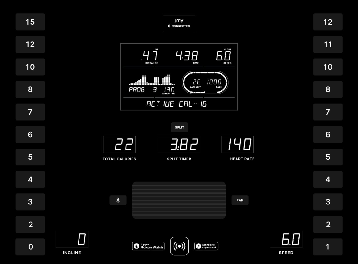
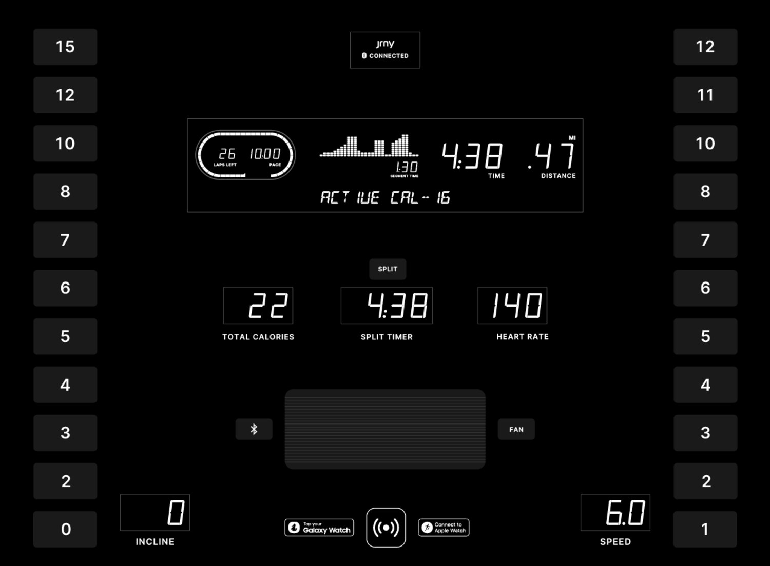
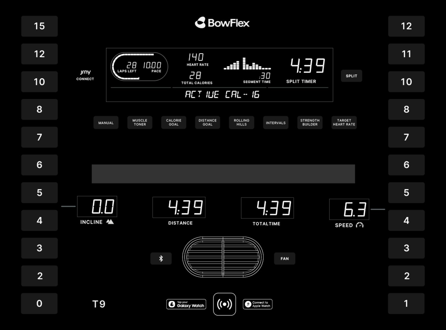
The final design, with the BowFlex T6 branding, rounded quick keys, and the metric grouping settled after all the whiteboard and stakeholder rounds:
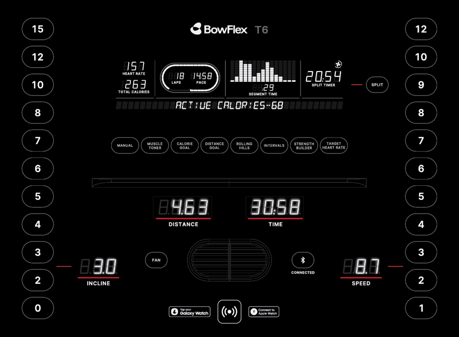
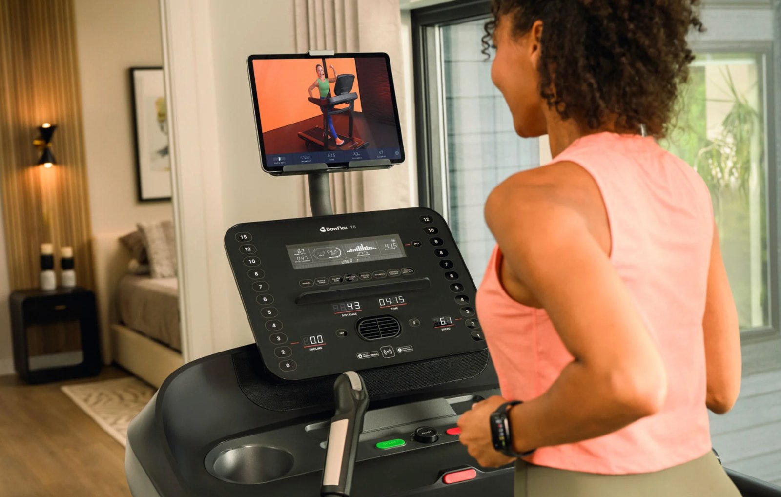
And the console in the real world: shipped and running:
Reception
The BowFlex T6 is available at BowFlex.com and major retailers including Dick's Sporting Goods. Customer feedback on the console has been broadly positive, with users specifically calling out the clarity and ease of use of the display.
Reflection & Learnings
What physical products
taught me about UX
Constraints sharpen design thinkingThe LED window constraint forced every decision to be intentional. Without the ability to reorder or resize elements in software post-launch, the layout had to be right the first time. That level of accountability makes you a more rigorous designer.
Cross-functional collaboration produces better outcomesWorking closely with industrial designers meant thinking beyond the screen, considering physical ergonomics, manufacturing feasibility, and the full object experience. UX principles translate to hardware, but the vocabulary is different. Learning to speak both languages made me a stronger collaborator.
Hierarchy is everything when you can't rely on colorOn an LED console, size and position are your only tools for communicating importance. It reinforced a principle I carry into every digital project: if a layout only works because of color, it isn't working hard enough.