JRNY Explore
the World
Giving JRNY users control over their Explore the World routes, so they can pick up where they left off, track their progress, and know at a glance which routes they've seen in full.
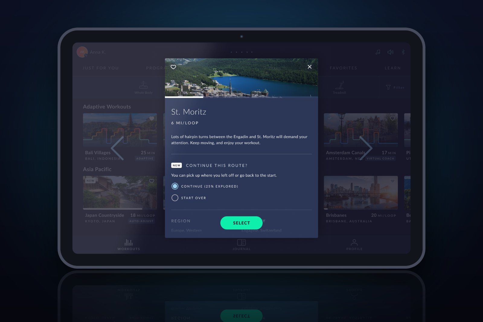
The Short Version
The Problem
Every time a user selected an Explore the World route, it started from the beginning, meaning some users never saw the full route, no matter how many times they worked out.
My Approach
Designed a resume/restart prompt before workout start, added progress indicators on cards and preview modals, and introduced a completion checkmark for fully-looped routes.
The Outcome
Users can now continue from where they left off, see how much of a route they've explored, and quickly identify which routes they've completed a full loop of.
Context & Problem
Always starting
from the beginning
JRNY's Explore the World feature offers recorded routes from around the world: immersive video workouts that match the pace of the user in real time, no matter what cardio machine they're on. It's one of the most loved features in the app.
Each route has a set distance (typically 4 to 12 miles) before the video loops back to the beginning. The problem: every time a user selected a route, it started from the beginning. No memory of where they'd previously stopped. No way to pick up where they left off.
"Some users do shorter workouts and can never get past a certain point in a route, so they never see the rest of it, no matter how many times they work out. They're always stuck in the first few miles."
The result: users felt like they were going in circles, literally. A beloved feature was creating a frustrating, repetitive experience for a significant portion of the user base.
My Role & Scope
Two touchpoints,
one coherent experience
The solution needed to surface in two places: the workout card in the browse view, and the preview modal before starting. The resume/restart choice lives inside the preview modal itself. Each touchpoint had a different job, but together they tell a coherent story about where the user is in any given route.
Workout Card
- Show progress along the route
- Show completion checkmark
- At-a-glance status while browsing
Preview Modal
- Show progress + % completed
- Show completion checkmark
- Resume or start over: user's choice
JRNY runs on iOS, Android, and embedded screens built into BowFlex cardio equipment. All three surfaces needed to support these changes consistently.
Progress Indicators
Know where you are
before you tap
The first step was giving users visibility into their route progress while browsing. Both the workout card and the preview modal now show how much of the route the user has completed, so they always know how far they've gotten before deciding what to do next.
Card
Progress shown on the card
A visual progress indicator on the workout card shows how far along the route the user has gotten, visible at a glance while browsing, before tapping into the preview.
Modal
Percentage in the preview modal
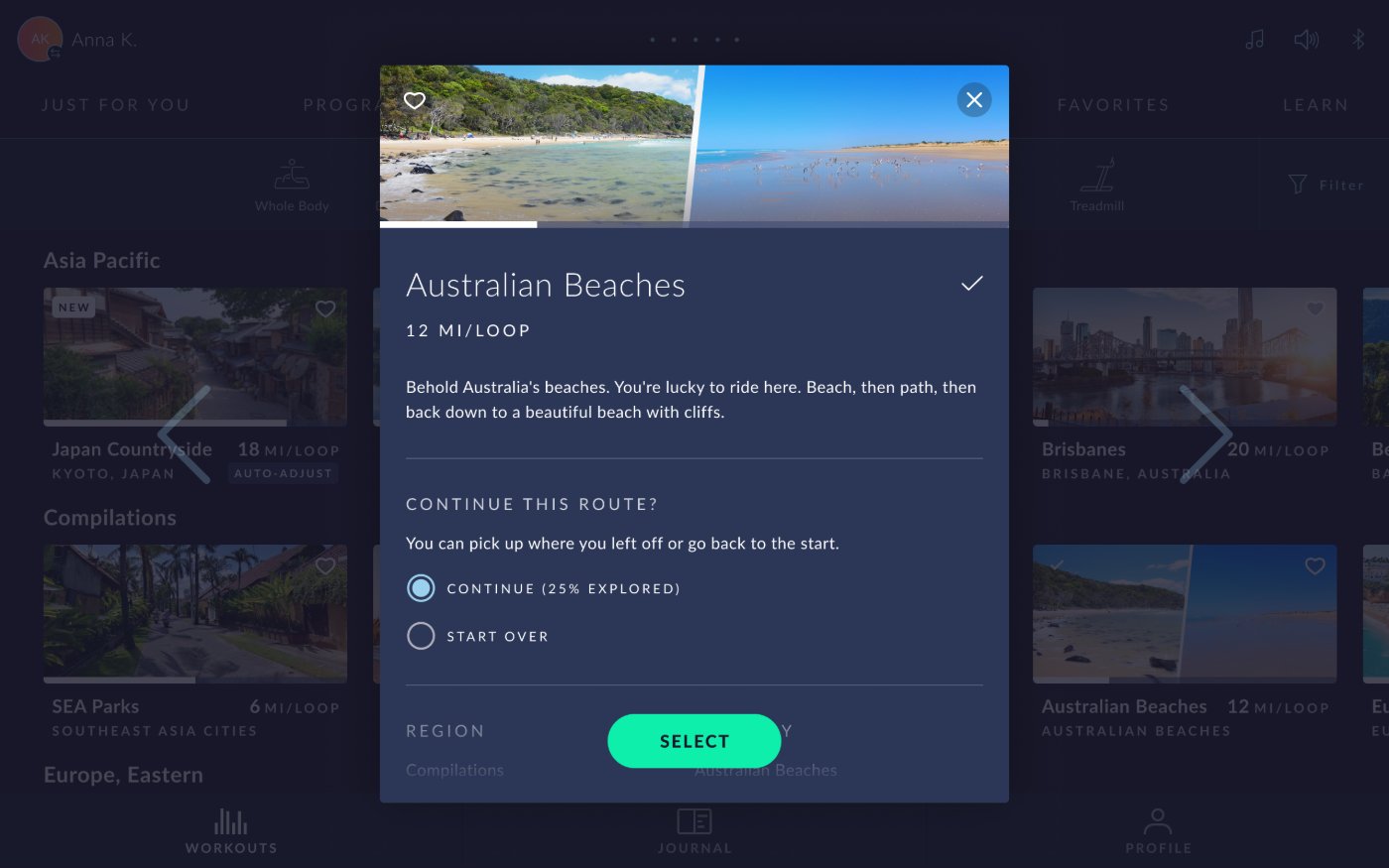
The preview modal shows the same progress indicator plus the exact percentage completed, giving users a clear, specific sense of how much of the route they've experienced.
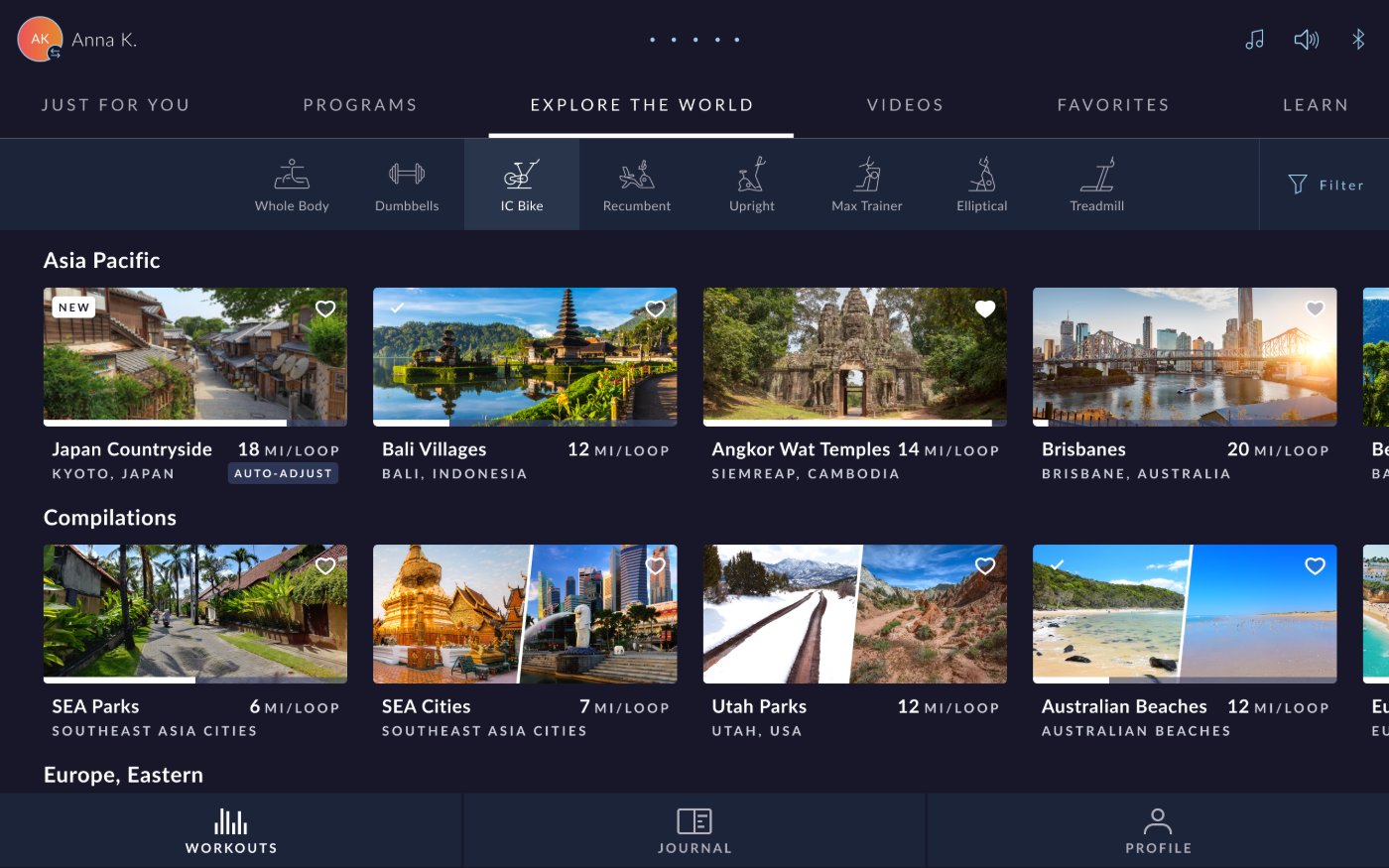
Workout Card
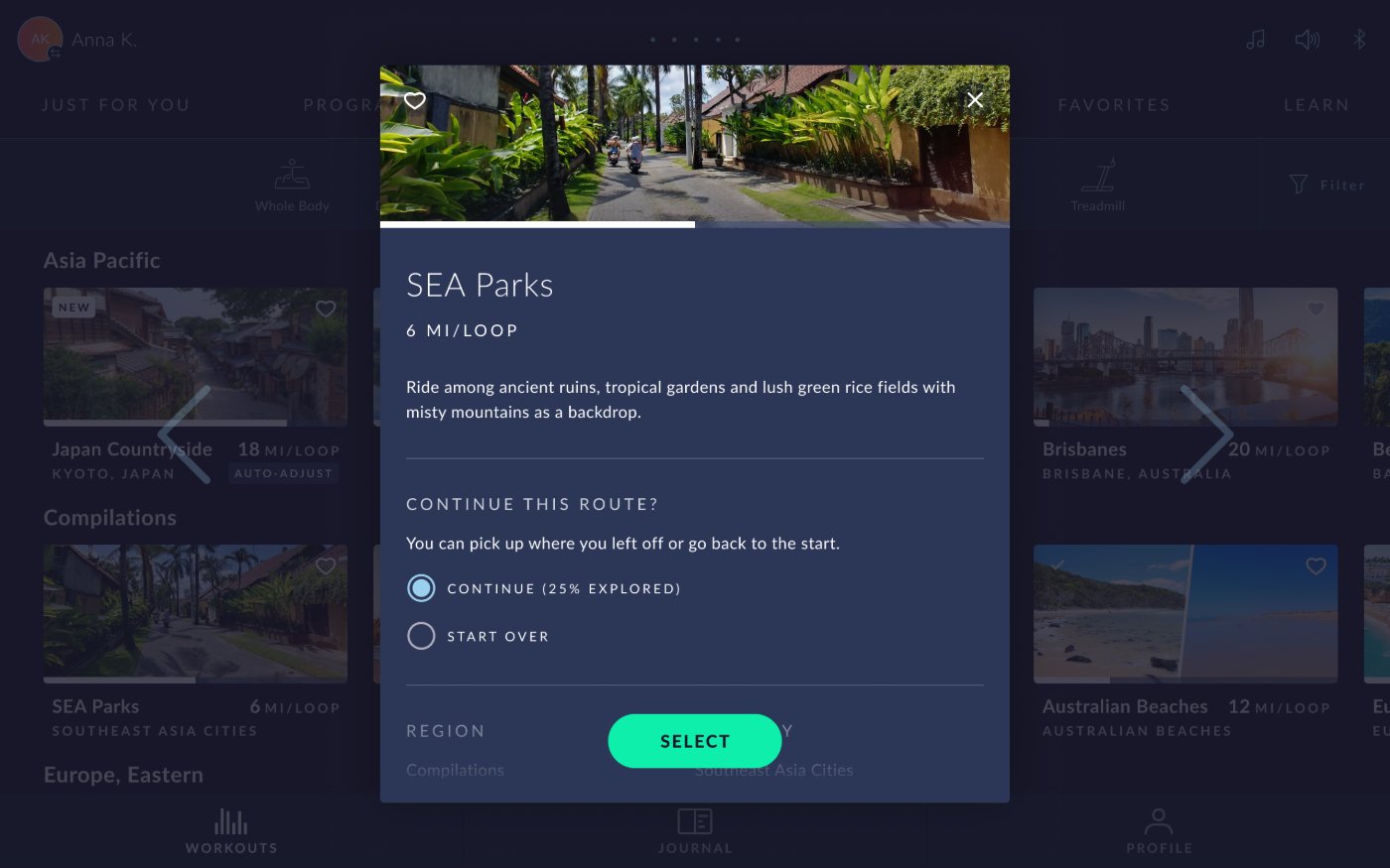
Preview Modal
The Core Solution
Give users the choice
before they start
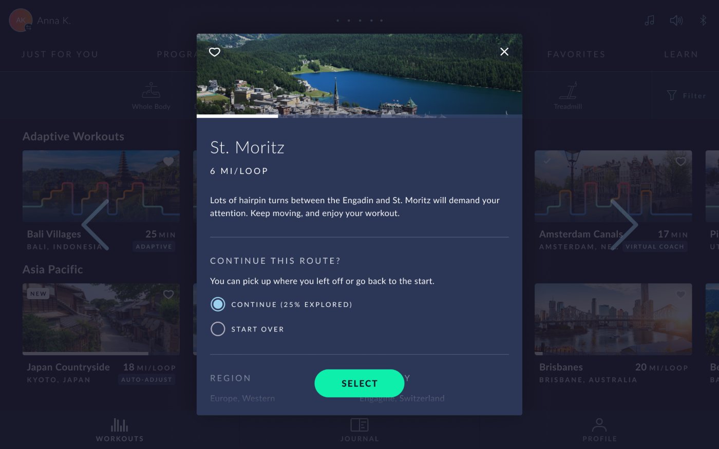
With progress now visible, the core solution follows naturally: a pre-workout prompt. When a user selects a route they've previously started, they're shown a screen that lets them decide: pick up where they left off, or start from the beginning. Simple, clear, one decision.
This only appears for routes the user has already begun. A fresh route skips the prompt entirely and starts as it always has. No added friction for new routes, only a helpful choice for returning ones.
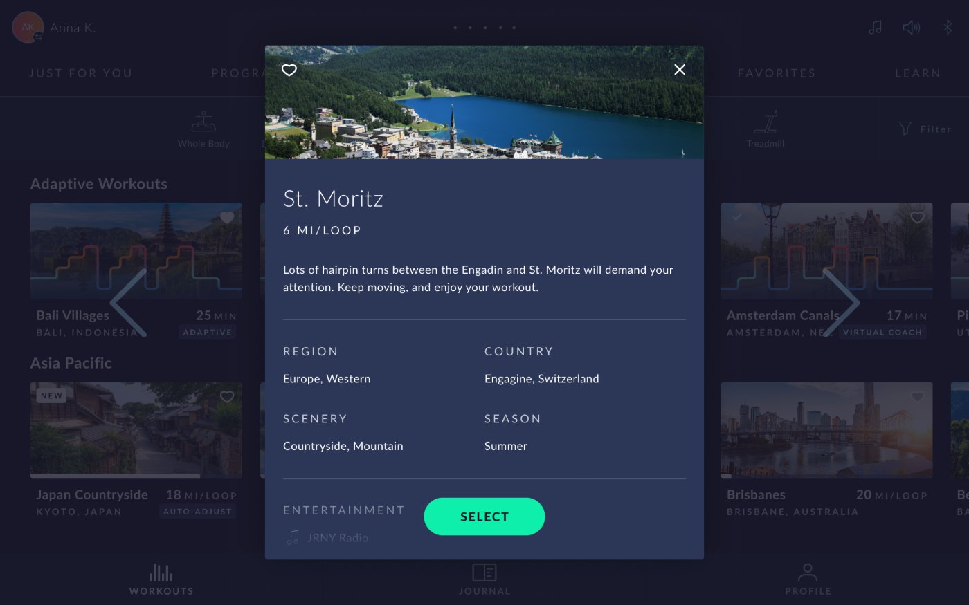
No Prompt
With Prompt
Completion State
A checkmark for
routes seen in full
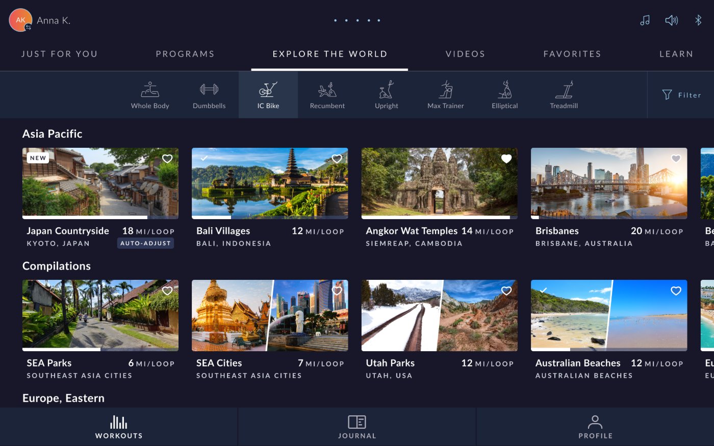
When a user completes a full loop of a route, seeing every mile from start to finish, both the card and preview modal display a checkmark. A simple, satisfying signal that says: you've seen all of this one.
This gives users a way to quickly scan their route library and see at a glance which routes they've fully explored and which still have new scenery waiting. It turns the browse experience into something closer to a collection: routes to discover, routes you've seen.
Workout Card
Preview Modal
Reflection
Small choices,
big difference in feel
User control changes how a feature feelsThe Explore the World feature wasn't broken. Users loved it. But removing a single frustration (always starting over) transformed how it felt to use. Sometimes the best UX work is getting out of the user's way.
Progress visibility adds intrinsic motivationShowing how much of a route a user has completed introduces a subtle but real sense of progression. The checkmark in particular adds a satisfying sense of completion that the feature previously lacked entirely.
The prompt only appears when it's relevantA key design decision was to only show the resume/restart prompt for routes the user had previously started. New routes are unaffected. This keeps the experience clean for new users while solving the problem for returning ones.