JRNY
Color System
Auditing and rebuilding how color is used across the JRNY fitness app, fixing WCAG failures, reducing visual noise, and establishing clear rules for a more cohesive, accessible experience.
The Short Version
The Problem
JRNY used colors inconsistently and without rules: too many colors, unclear meaning, WCAG failures on copy and buttons, and no clear distinction between tappable and non-tappable elements.
My Approach
Full color audit → identify patterns and missing rules → present findings and proposed solutions to team and stakeholders → redesign with new color rules in collaboration with a UI designer.
The Outcome
All copy and text now passes WCAG AA. Team and stakeholder feedback: the app feels cleaner, less noisy, and easier to scan, reducing frustration and improving usability.
Problem Statement
Too many colors,
not enough meaning
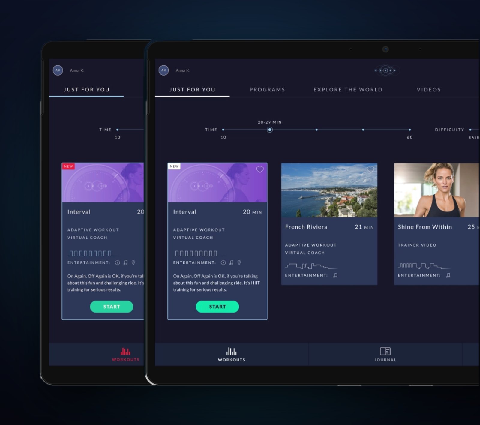
When I joined the JRNY team, I noticed quickly that color usage across the app felt scattered. Colors appeared in many places, but without consistent rules, so the same color could mean different things in different parts of the app, or nothing in particular at all.
The cumulative effect was visual noise: an app that was harder to scan, harder to trust, and harder to use. And beneath the surface, there were real accessibility failures: colors that didn't pass WCAG AA contrast requirements on copy, buttons, and navigation elements.
"It wasn't always obvious what items were tappable. Color was being used decoratively rather than communicatively, which was creating confusion without anyone realizing it."
Three core problems to solve: WCAG failures on text and interactive elements, no clear affordance distinguishing tappable from non-tappable items, and no shared rules the team could refer to going forward.
My Role & Context
A systems problem
that needed a systems fix
I led the audit and UX direction on this project, working closely with a UI designer to execute the updated designs. This wasn't a single-screen fix. It required looking at the entire app, finding every instance of color, and building a coherent system from what we found.
JRNY runs across three surfaces, each with its own constraints:
iOS & Android
- Primary mobile experience
- Full app functionality
- Standard accessibility expectations
Embedded Screens
- Built into BowFlex cardio equipment
- Used mid-workout
- Viewed at distance, often in motion
My Scope
- Full color audit
- Rule definition
- Stakeholder buy-in
- Updated designs
Color Audit
Finding every color
in every context
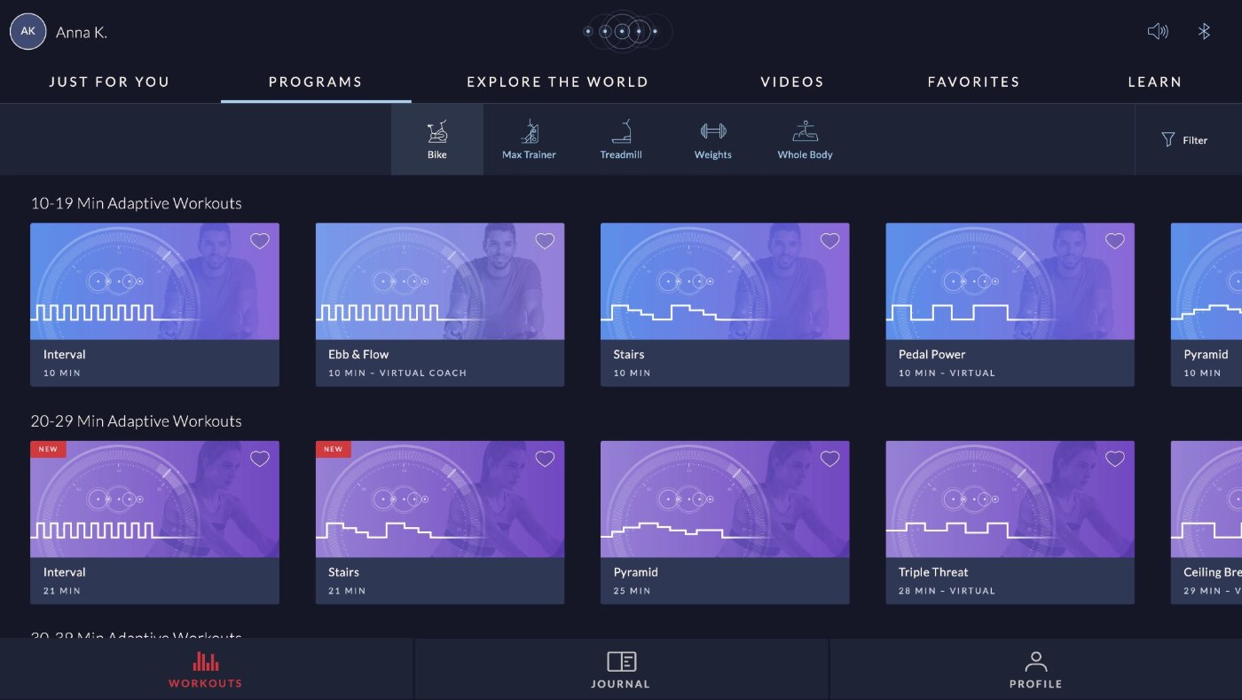
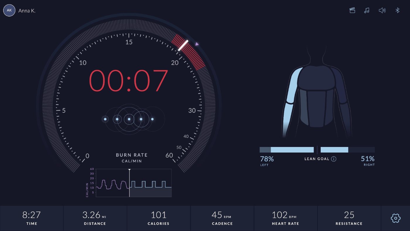
The audit started with a systematic sweep of the app, cataloguing every color in use, where it appeared, and what it was being used to communicate. The goal was to find patterns, identify misuse, and surface the WCAG failures.
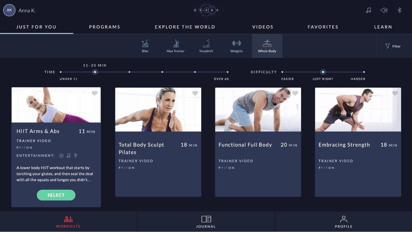
What I found: colors were being applied based on visual preference rather than meaning. The same light blue appeared on standalone links, inside button labels, as decorative accents, and on informational text, with no consistent rule tying those uses together.
Just For You
Programs
In-Workout
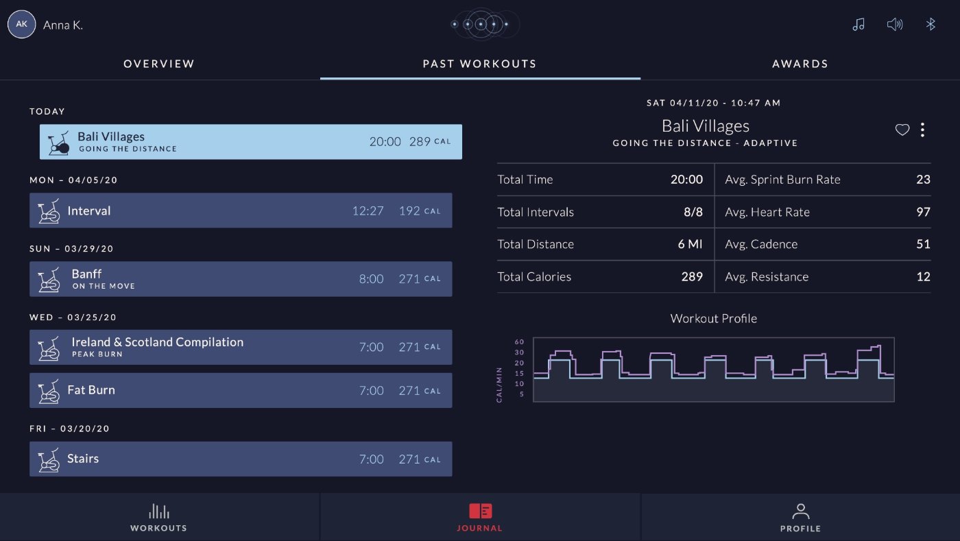
Journal
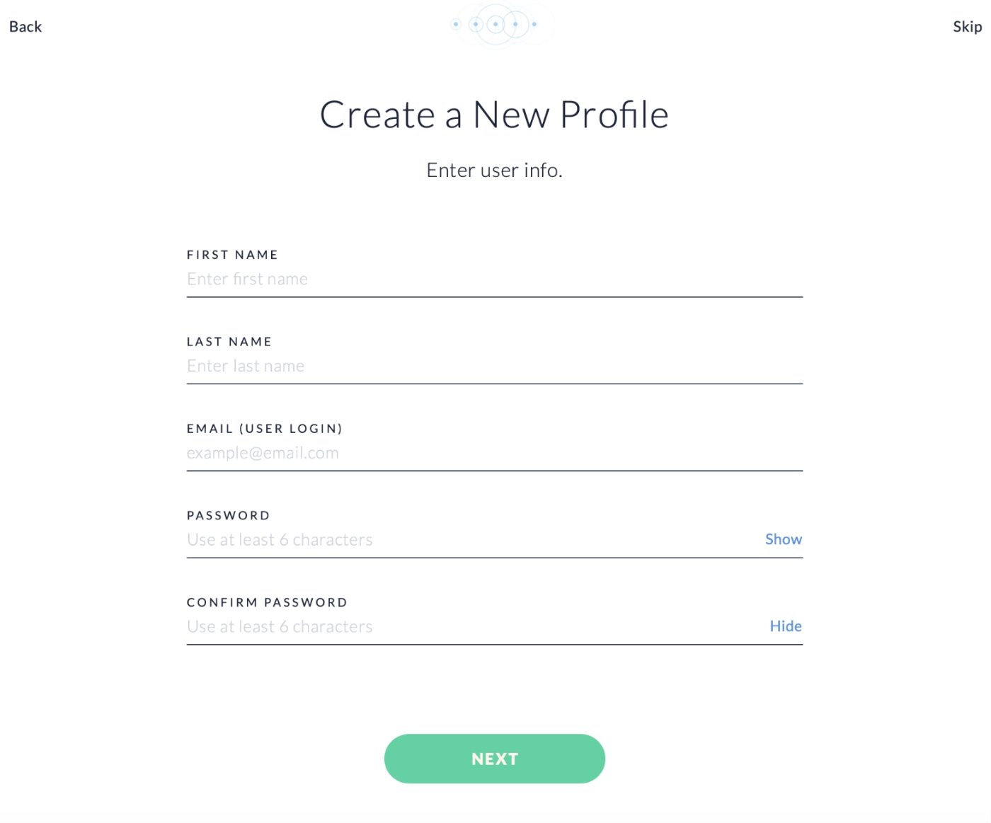
Create Profile
The audit also flagged the WCAG failures: specifically contrast issues on the main CTA color (a light label on the green button) and navigation colors (red on dark blue), which didn't meet the AA minimum of 4.5:1.
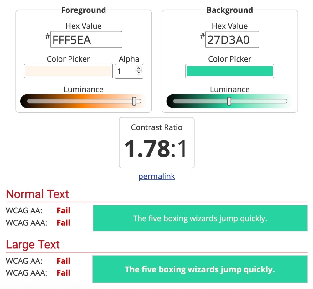
Main CTA · 1.78:1
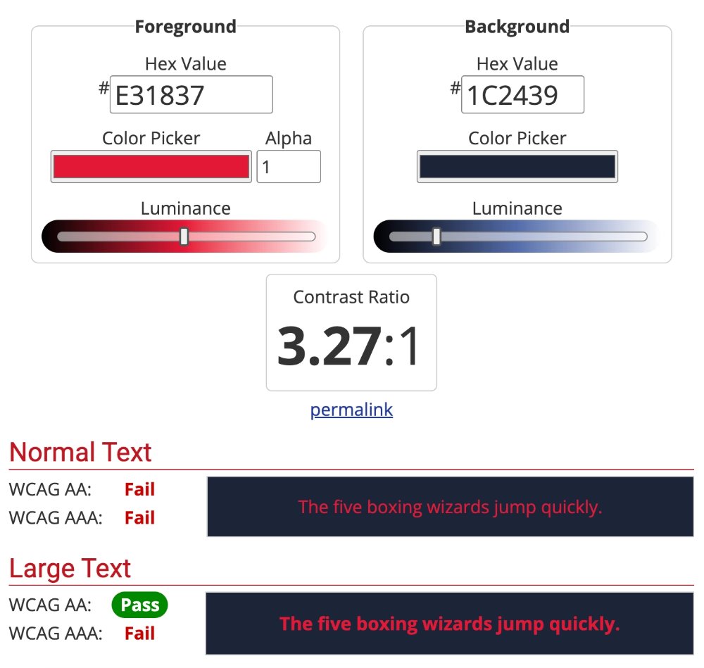
Navigation · 3.27:1
Insights
Patterns in
the noise
The audit surfaced four core problems, each with a clear design solution.
01
No tappability signal
Light blue was being used for both interactive and non-interactive elements, making it impossible for users to reliably distinguish what was tappable. Needed a clear, consistent rule.
02
WCAG failures on key elements
Main copy, button labels, and navigation items had contrast ratios below 4.5:1, failing AA. These were the highest-priority fixes, directly impacting readability for all users.
03
Color meaning was undefined
Purple appeared in several places but without a shared meaning. Red appeared in non-error contexts. There was no color-to-meaning mapping the team could reference when making design decisions.
04
Selected/unselected states were unclear
In navigation and filter elements, the visual distinction between selected/connected and unselected/disconnected states was inconsistent, creating confusion about the current state of the UI.
The Color Rules
Less color, more
meaning
Working with the UI designer, we established a clear set of rules: not just a palette, but a semantic system. Every color decision now has a reason, and every team member has a shared reference point.
●
Light blue = standalone tappable only
Light blue is used exclusively for standalone interactive elements: standalone links and icons. If a text label and icon are bundled inside a button outline, they use white instead.
●
Purple = user output & effort
Purple is reserved for representing the user's own output or effort: metrics like calories burned, personal records, or performance data. It signals "this is about you."
●
Red = error states only
Red is strictly reserved for error states. No decorative use, no warning states, just errors. This makes red immediately meaningful and trustworthy when it appears.
●
White/Gray = selected/unselected states
In navigation and filter elements with connected/disconnected or selected/unselected states: white = selected or connected, gray = unselected or disconnected. Consistent across all instances.
"All text must pass WCAG AA. This became a non-negotiable baseline, not an afterthought. Every color decision goes through a contrast check before it ships."
Before & After
The same screens,
cleaner
With the rules defined and stakeholder buy-in secured, I worked with the UI designer to update the designs. The changes were intentionally restrained: the goal wasn't a visual overhaul, but a clarification. Less color in more deliberate places.
Just For You. The green Select button becomes white with dark text (passing AA), and light blue is pulled back from decorative labels so it only marks tappable items. The red nav icon gives way to the white-selected / gray-unselected rule.
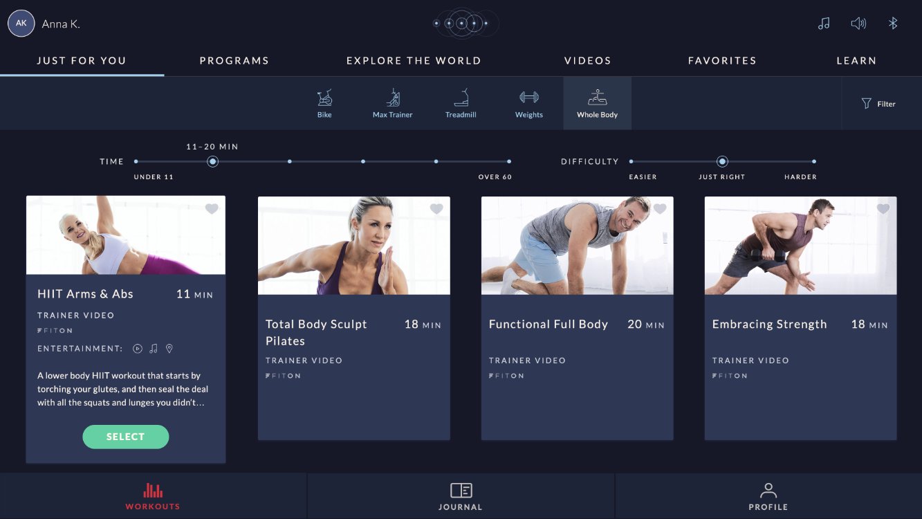
Before
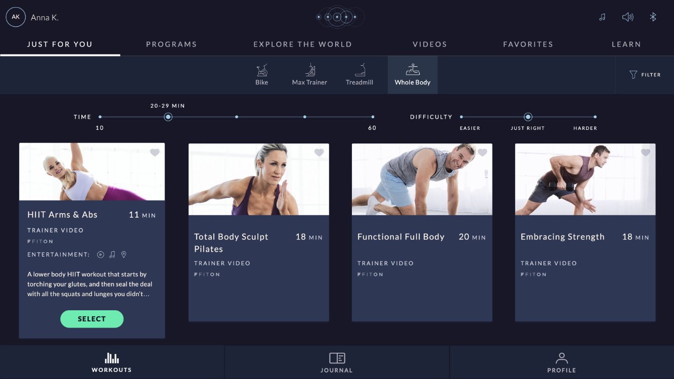
After
Videos. Green completion checkmarks and underlines, which implied meaning the color didn't have, become neutral white, and the red NEW badge is reserved so red can keep its error-only meaning.
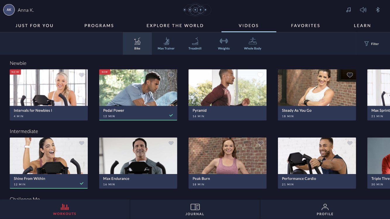
Before
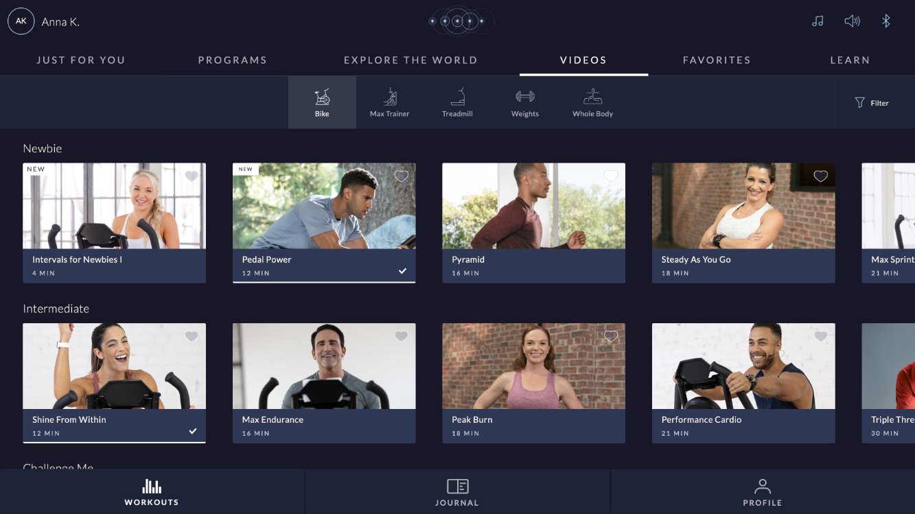
After
Workout preview modal. The GO button moves from the failing green-and-light-text combination to a contrast-safe treatment, and the NEW badge follows the same neutral rule as the cards.
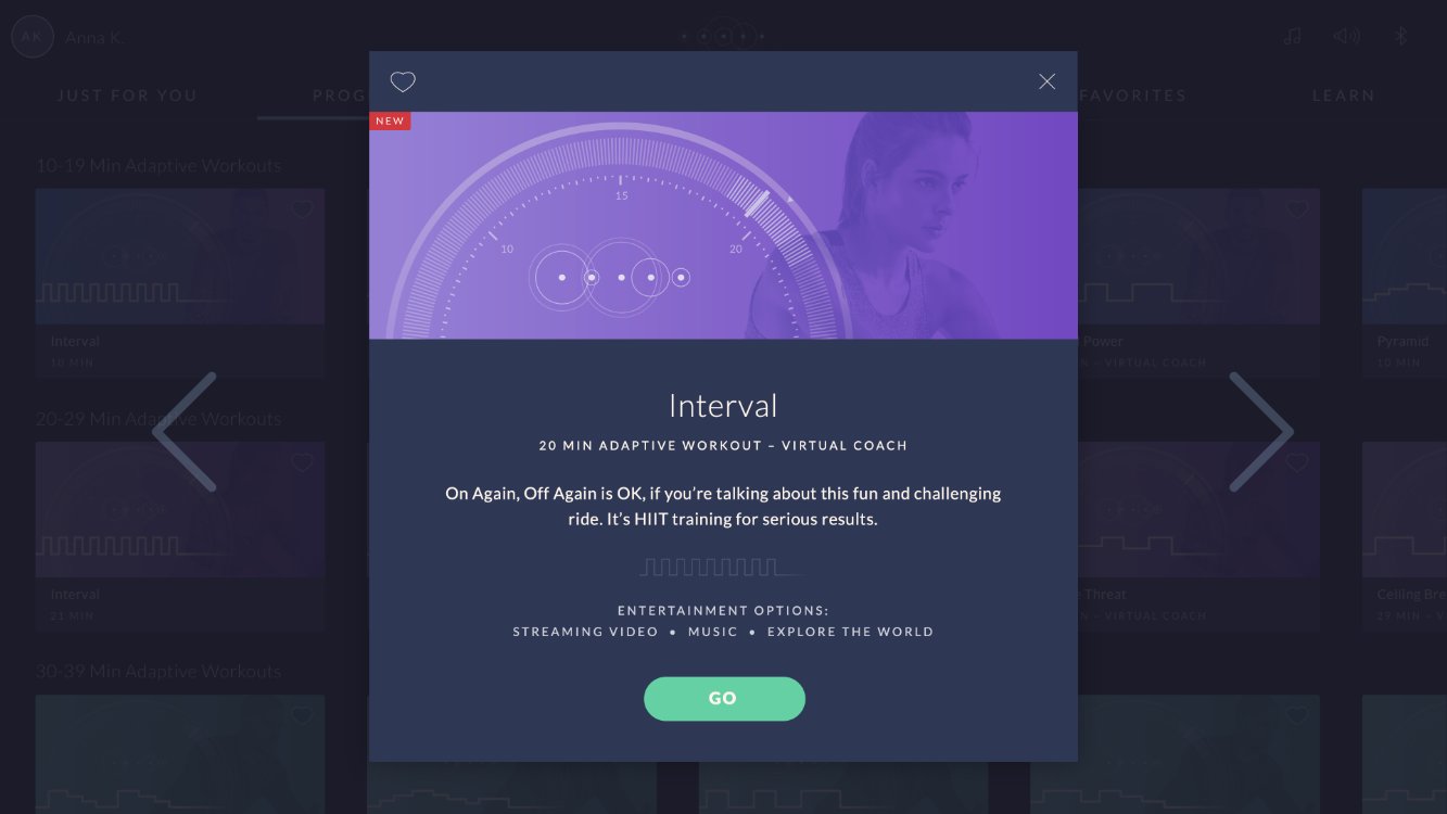
Before
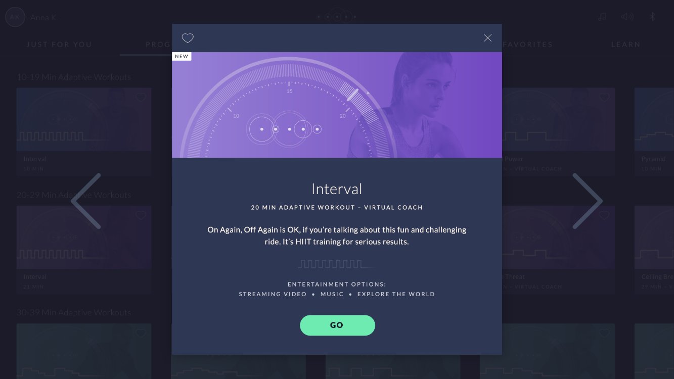
After
Journal. The selected workout switches from a light blue fill to the white-selected rule, machine icons drop their decorative tint, and the red Journal nav icon becomes white, leaving the workout profile graph's purple to represent the user's effort, per the rules.
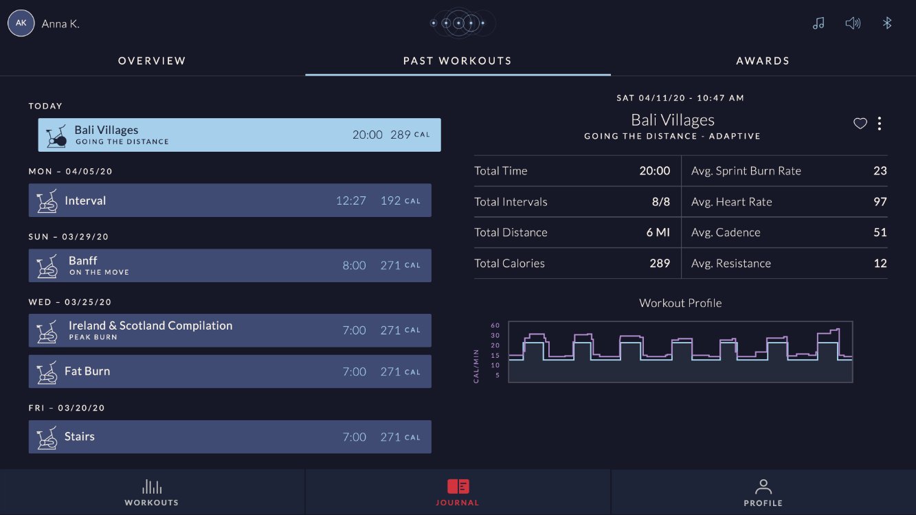
Before
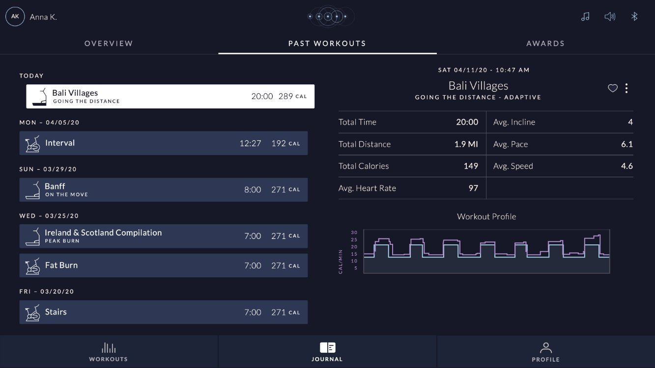
After
Outcome
Cleaner, quieter,
easier to use
AA ✓
All copy and text
passes WCAG AA
5
Clear color rules
established for the team
↓
Visual noise reduced,
easier to scan and navigate
Team and stakeholder feedback consistently described the updated app as cleaner and more pleasant to look at. Less visual noise means users can scan and find what they're looking for without frustration, a direct usability win that doesn't require a single user test to validate.
Beyond the immediate fixes, the real value is the system going forward. Every new feature, every new screen, every new designer who joins the team now has a shared color language to work from.
Reflection
Design systems work
is UX work
Accessibility isn't a separate trackFixing WCAG failures wasn't a separate project from fixing the color system. It was the same project. When color is used with intention, accessibility follows naturally. Treating it as an audit item rather than a design principle is what causes these problems in the first place.
Rules are a design deliverableThe updated screens were important, but the rules were the real output. A screen can be changed. A shared, agreed-upon rule changes how every future screen gets made. That's where the long-term value lives.
Getting buy-in before building saves timePresenting the findings and proposed solutions to the team and stakeholders before designing the fixes meant no surprises, no rework, and genuine investment in the outcome from everyone involved.