JRNY Program
Brickyards
Redesigning how workout intensity brickyards are displayed across JRNY, giving users the context they need to find the right workout faster, while improving awareness during adaptive workouts.
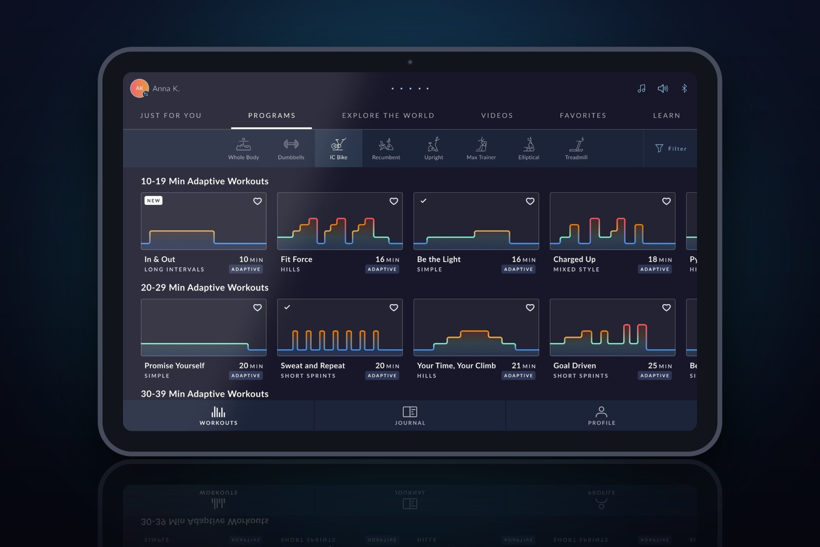
The Short Version
The Problem
Workout brickyards looked like squiggly lines, giving users almost no information about what to expect during a workout when browsing cards and preview modals.
My Approach
Defined a target zone color and description system → redesigned brickyards in cards and preview modals → added in-workout target zone awareness for adaptive workouts.
The Outcome
Users can now instantly understand workout intensity at a glance. Less guessing, faster browsing, and real-time awareness of which target zone they're in during a workout.
Context & Problem
A squiggly line
isn't a workout preview
JRNY offers workouts for compatible cardio machines (treadmills, bikes, and ellipticals) as well as off-product workouts. One type of machine workout is called a Program: an individual workout with a predetermined brickyard that the user follows.
Programs come in two types: Adaptive workouts adapt to each user's output based on their past performance (measured by burn rate: calories per minute), while Standard workouts are static and identical for all users.
When users browse workouts, they scroll through rows and columns of cards. Tapping a card opens a preview modal with more detail. The problem: in both the card and the modal, the brickyard looked like a squiggly line with no color, no labels, and no context.
"The brickyard essentially looked like a squiggly line. The user had to do a lot of guessing about what that meant: how hard is this? How long are the hard parts? Is this right for me today?"
Users couldn't make informed decisions about which workout to choose. Browsing was slower and more frustrating than it needed to be.




My Role & Scope
Three surfaces,
one system
JRNY runs on iOS, Android, and embedded screens built into BowFlex cardio equipment. The brickyard improvements needed to work across all three: from browsing on your phone to glancing at the console mid-workout.
Browsing (Card)
- More prominent brickyard shape
- Target zone colors visible
- Instant at-a-glance intensity read
Preview Modal
- Target zone colors + descriptions
- Clear adaptive vs. standard distinction
- Better context for what to expect
During Workout
- Current target zone always visible
- Zone description shown in real time
- Works across treadmill, bike, elliptical
Target Zone System
Five zones, five colors,
one language
Adaptive Program workouts use anywhere from 1–5 target zones depending on the goal of the workout. Target zones raise in effort: zone 1 is easy and relaxed, zone 5 is all-out effort. The first step was giving each zone a color and a description that would make sense across all JRNY cardio machines.
The descriptions had to be machine-agnostic: meaningful whether you're on a treadmill, a bike, or an elliptical. No speed numbers, no resistance levels, just a felt sense of effort.
Zone 1
Easy & Relaxed
The lowest effort zone. Used for warm-ups, recovery segments, and cool-downs. Color: Blue.
Zone 2
Comfortably Steady
A sustainable, aerobic pace. Used for longer steady-state segments. Color: Green.
Zone 3
Moderate Intensity
Noticeably harder: conversation becomes difficult. Color: Yellow.
Zone 4
Challenging
High intensity: uncomfortable but sustainable for short bursts. Color: Orange.
Zone 5
All-Out Effort
Maximum exertion. Used for peak intervals only. Color: Red.
Standard Program workouts don't use target zones and don't adapt to users, so their brickyards use a consistent blue across all workouts. This keeps them visually distinct from adaptive workouts and avoids any confusion between the two.
Workout Card Improvements
More context
at a glance
In the browse view, users see rows and columns of workout cards. The brickyard needed to be immediately readable, before the user even taps. The updated card makes the brickyard shape more prominent and applies target zone colors directly to each segment.
A user can now glance at a card and immediately know: is this mostly easy with a few hard spikes? Is this progressively harder? Is it a standard workout? That's information that used to require tapping into a preview modal and still guessing.
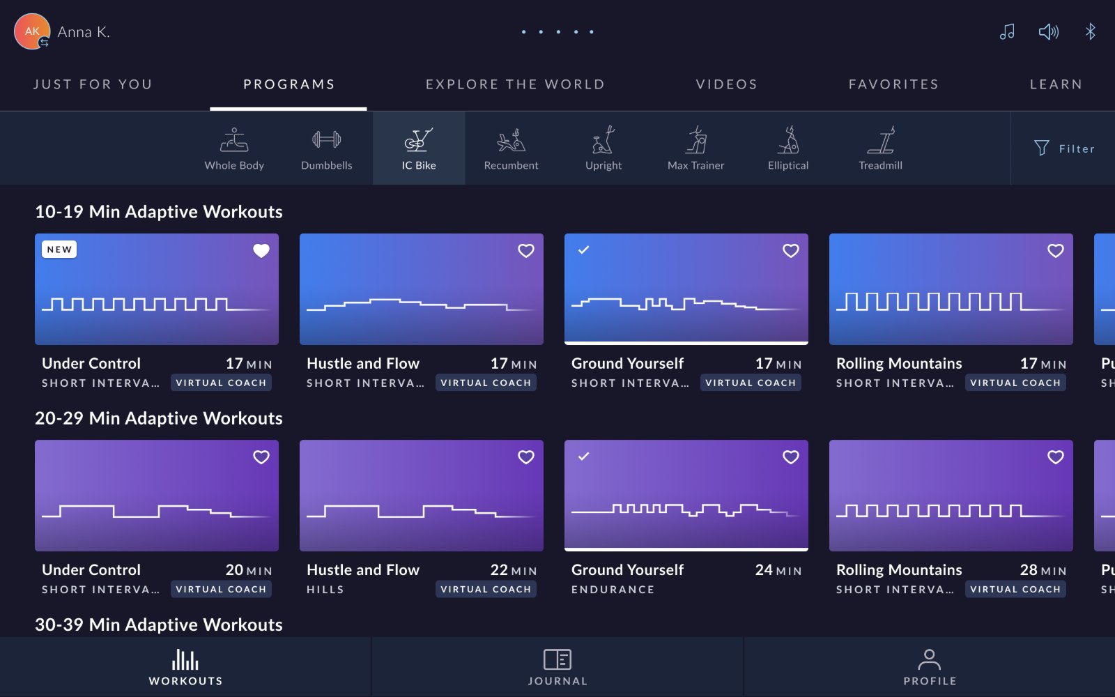
Before
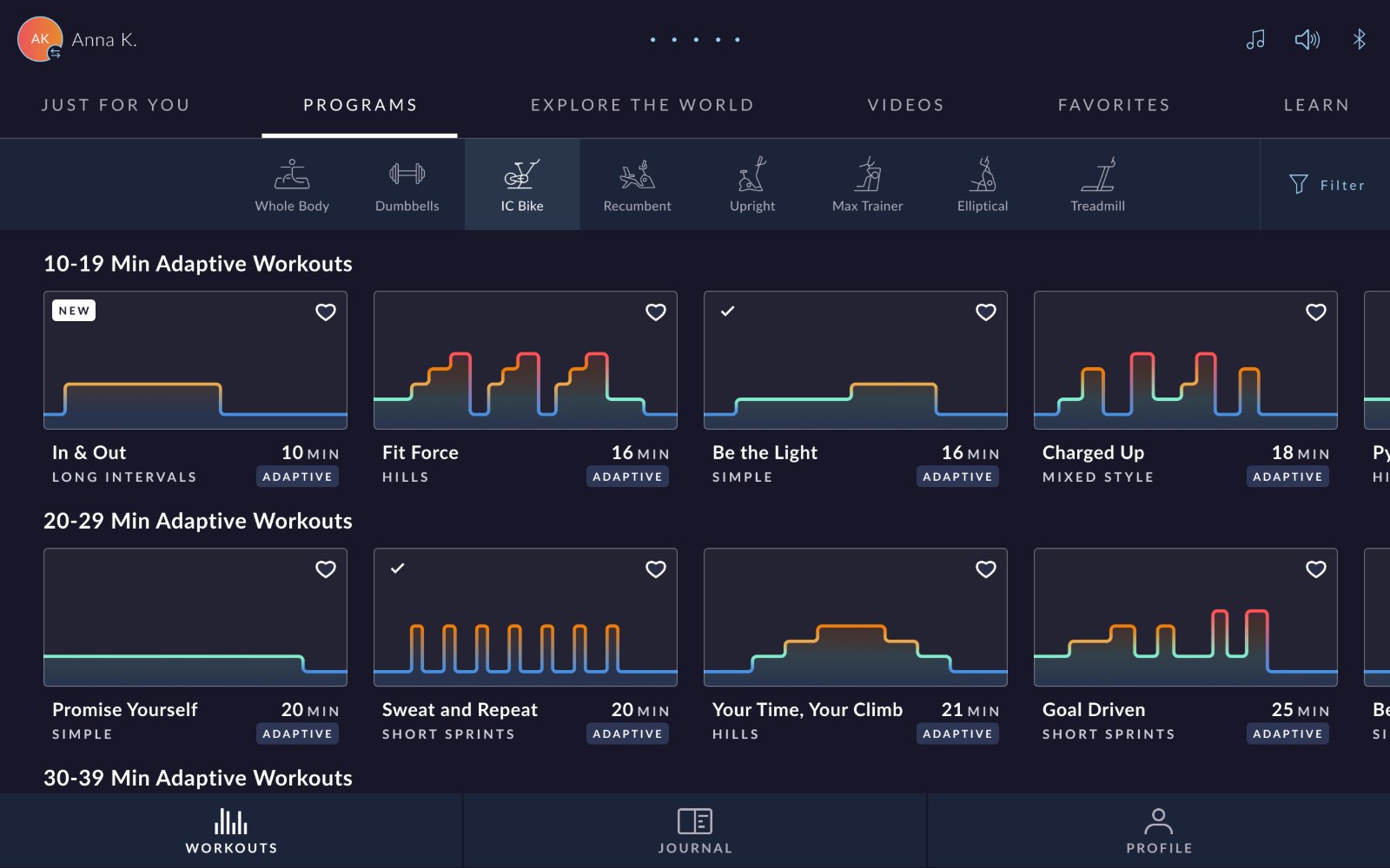
After
Preview Modal Improvements
More detail
when you need it
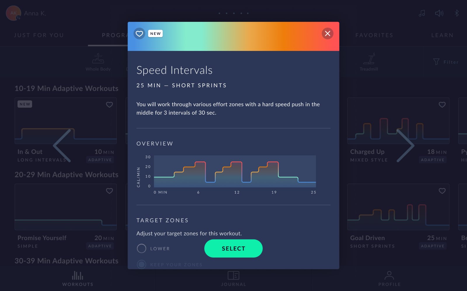
When a user taps a workout card, a preview modal opens with more detail. For adaptive workouts, the updated modal now shows the brickyard with target zone colors, includes the zone descriptions, and gives users a much clearer picture of what the workout will feel like, and how it adapts to them.
The key distinction here is the adaptive nature of these workouts. The brickyard shape is the same for all users, but the actual intensity adapts based on each person's burn rate from past workouts. The modal communicates this clearly, so users understand what "adaptive" means for them specifically.
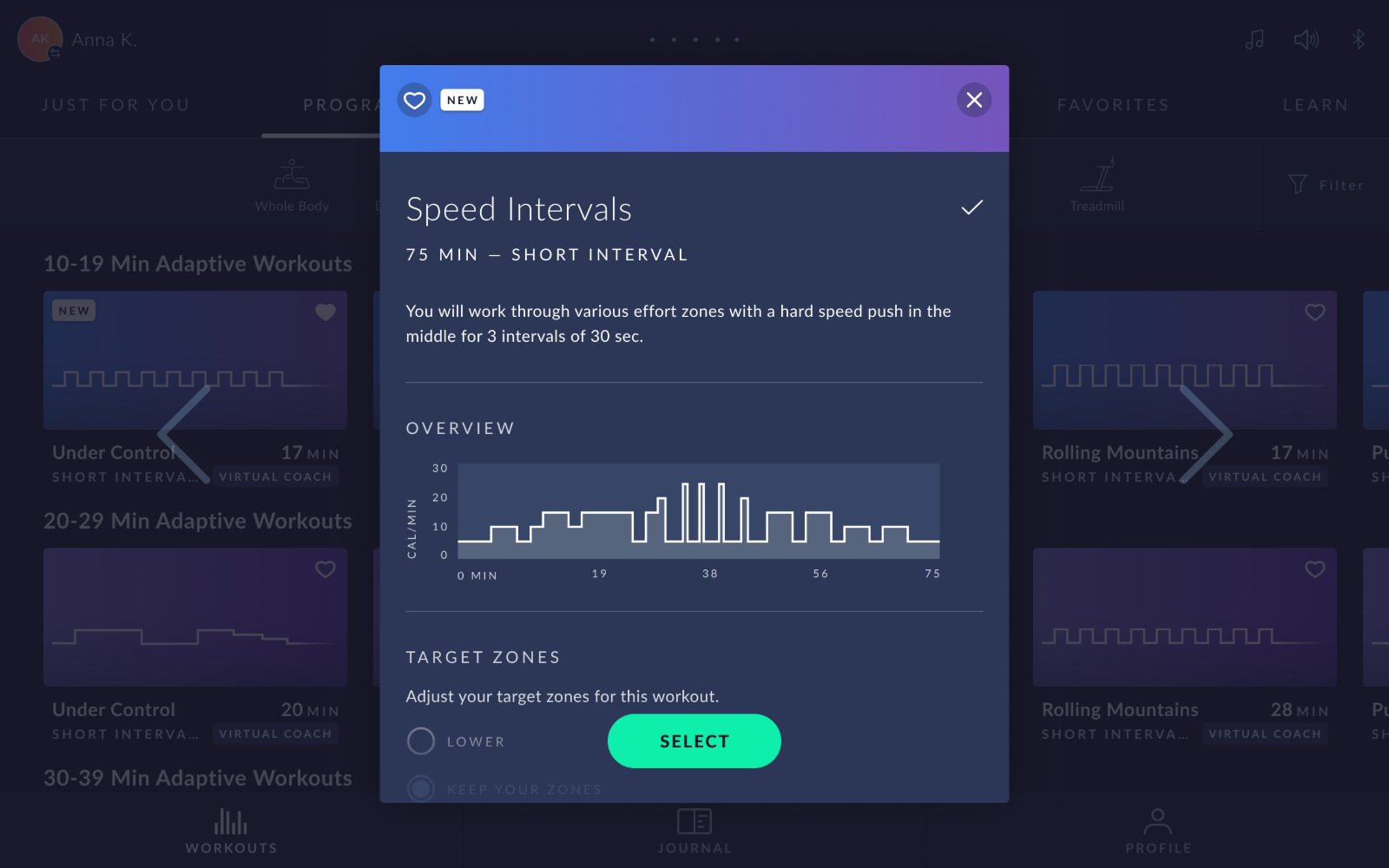
Before
After
In-Workout Experience
Always knowing
where you are
During an adaptive Program workout, users now always see which target zone they're currently in, along with the zone's description. This real-time awareness helps users understand their current effort level and know what's coming next.
Because descriptions are machine-agnostic ("easy and relaxed," "all-out effort"), this works identically whether the user is on a treadmill, a bike, or an elliptical, and whether they're using the mobile app or the embedded screen on their equipment.
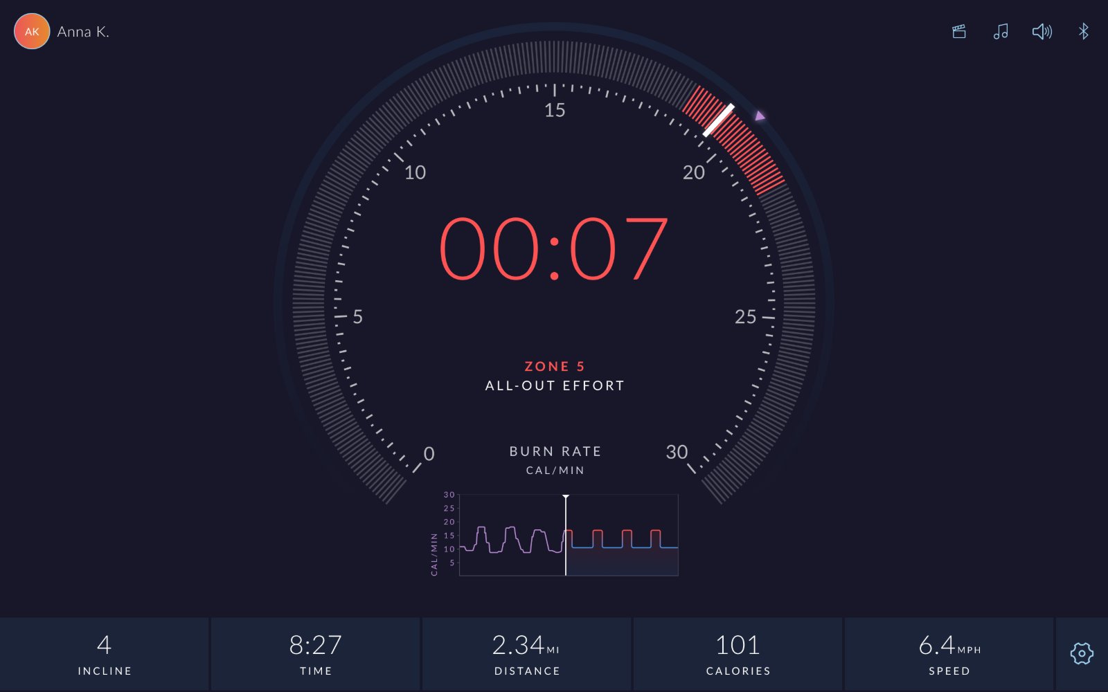
The color coding from the browsing experience carries through into the workout itself, so a user who saw orange segments in the preview knows exactly what "Zone 4 · Challenging" means when it appears on their screen mid-run.
Reflection
Information design
is UX design
Context reduces frictionThe brickyard was always there. The shape was correct. But without color and description, it communicated almost nothing. Adding meaning to existing UI elements is often more impactful than adding new ones.
Consistency across surfaces requires machine-agnostic languageWriting descriptions that work for treadmill users, cyclists, and elliptical users simultaneously pushed me to think in terms of felt effort rather than specific metrics. That constraint produced better copy than I would have written without it.
The browsing experience shapes the workout experienceWhen a user understands what a workout will feel like before they start, they arrive better prepared, mentally and physically. Good pre-workout communication is part of the workout experience.