JRNY
Navigation
Restructuring how JRNY users browse workouts so the navigation follows the way they actually decide: equipment first, then workout type, with no dead ends along the way.
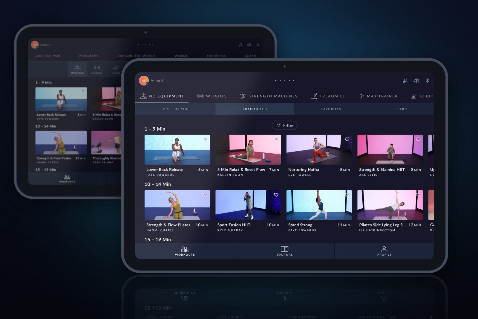
The Short Version
The Problem
JRNY's navigation made users pick a workout type before their equipment, which is backwards from how people decide. It also led to empty dead-end screens and mislabeled content.
My Approach
Flipped the hierarchy to equipment first, hid workout types with no content, moved the filter next to the workouts, renamed Videos to Trainer-Led, and reorganized equipment into No Equipment and Weights.
The Outcome
Users browse in the order they think, with no dead ends. Within weeks of release, filter usage jumped and Dumbbells became a more popular filter.
Context & Problem
The navigation asked
the wrong question first
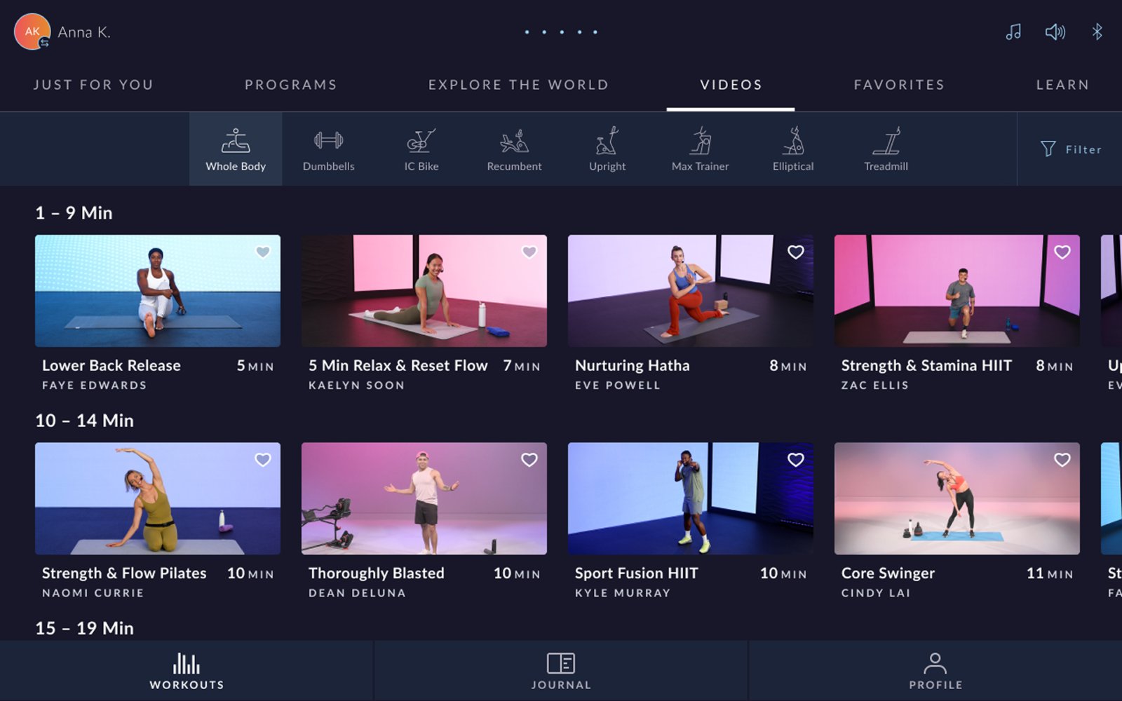
JRNY offers workouts for compatible cardio machines as well as off-product workouts. To browse them, users moved through two rows of navigation: a top row of workout types (Just For You, Programs, Explore the World, Videos, Favorites, Learn), and a second row of equipment beneath it.
That order didn't match how people actually think about a workout. Users already know what they're working out on, whether that's a treadmill, an IC Bike, or a pair of dumbbells, before they decide what kind of workout they want. The old structure made them choose a workout type first, then hunt for their equipment.
"People know what equipment they want to work out on first. Then they choose the type of workout. The navigation should follow that same order."
Several other problems compounded it: dead-end combinations, a filter that looked like it filtered the wrong thing, a vague "Videos" label, and equipment categories that didn't contain what their names promised.
My Role & Scope
Six problems,
one navigation
I owned the UX for the navigation and content structure update across JRNY's iOS, Android, and embedded screens on BowFlex equipment. The work covered six connected changes:
- Flip the hierarchy so equipment comes first and workout types second
- Remove dead ends by only showing workout types that have content
- Move the filter closer to the content it actually filters
- Rename "Videos" to something that describes the experience
- Reorganize equipment categories so every workout lives where users expect
- Simplify content rows by mixing adaptive workouts into the timed rows
Flipping the Hierarchy
Equipment first,
then workout type
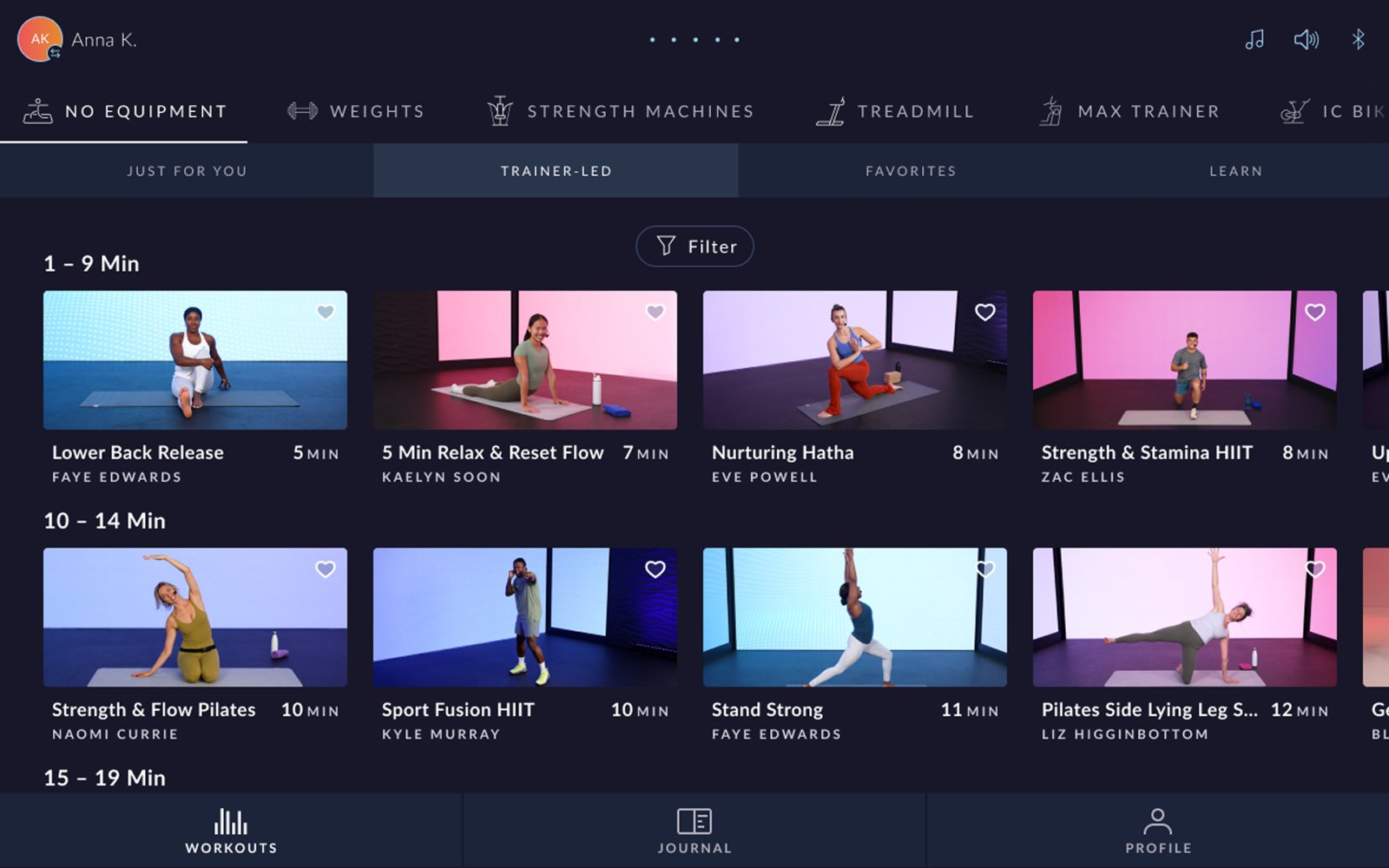
In the update, equipment moved to the top row and workout types moved beneath it. A user picks what they're working out on, then sees the ways they can work out on it. The navigation now reads in the same order as the decision.
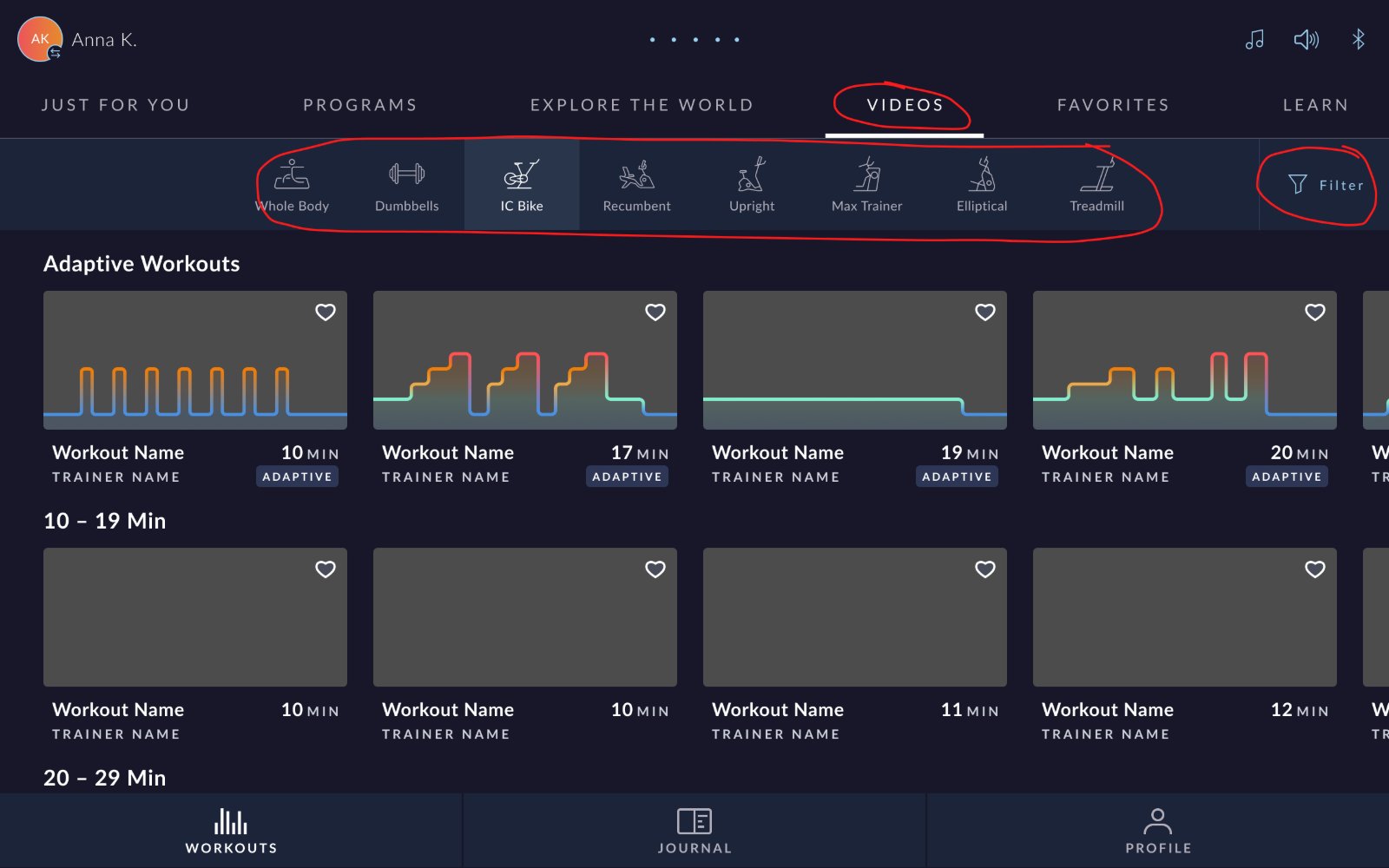
Before
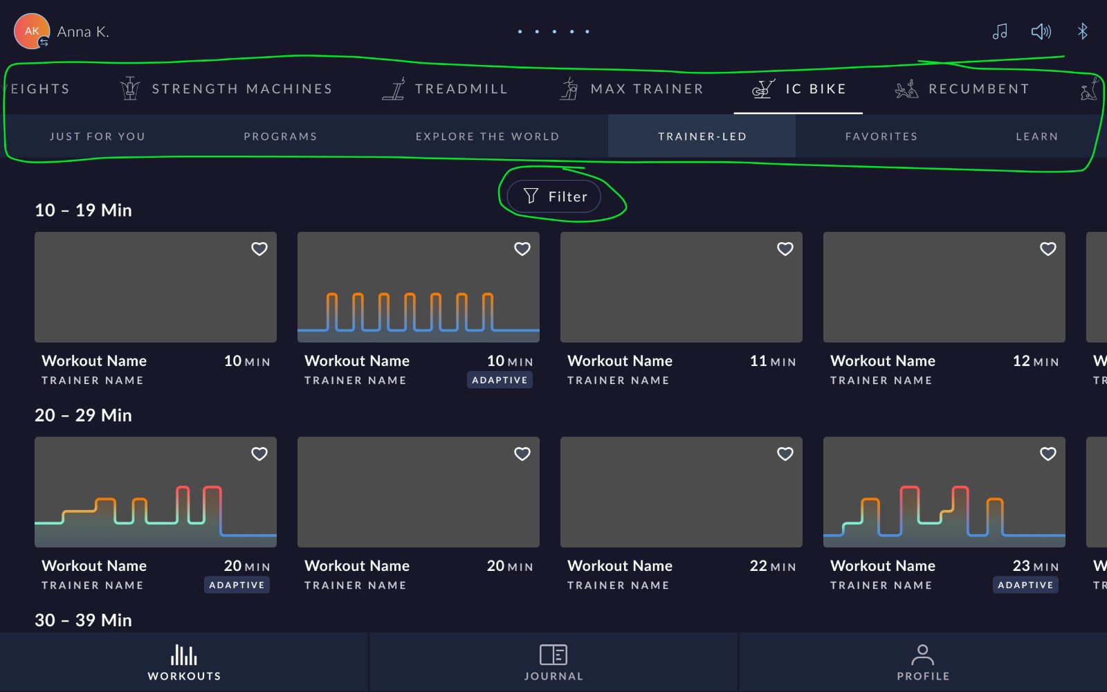
After
Removing Dead Ends
No more
empty screens
The old structure let users build combinations that had no content at all. Selecting Explore the World and then Whole Body, for example, landed them on an empty screen telling them the content wasn't available. That's a dead end the user should never have to hit.
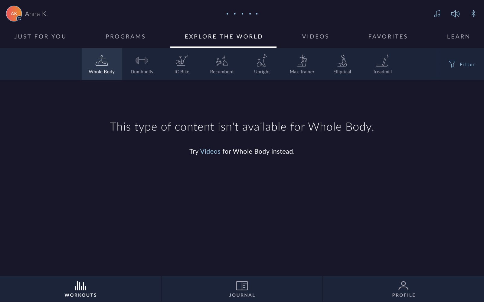
Now that equipment comes first, the second row only shows the workout types that actually have content for the selected equipment. If a combination would be empty, it simply isn't offered.
Moving the Filter
Closer to
what it filters
The Filter button used to sit inside the same container as the equipment row. Visually, it read as a way to filter the equipment rather than the workouts below. In the update, the filter moved down beside the content, so its relationship to the workouts is clear at a glance. You can see the change in the before and after above.
Early signal
The release went out only a few weeks ago, and filter usage has already jumped since the update.
Renaming Videos
From "Videos"
to "Trainer-Led"
Trainer-led workouts used to live under a tab called Videos. That label didn't tell users what they'd actually experience. It was also technically inaccurate as a distinction, since Explore the World content is video too, which caused confusion between the two.
The tab is now called Trainer-Led, which describes the experience itself: a workout guided by a coach.
Videos
Trainer-Led
Reorganizing Equipment
Every workout
where you'd expect it
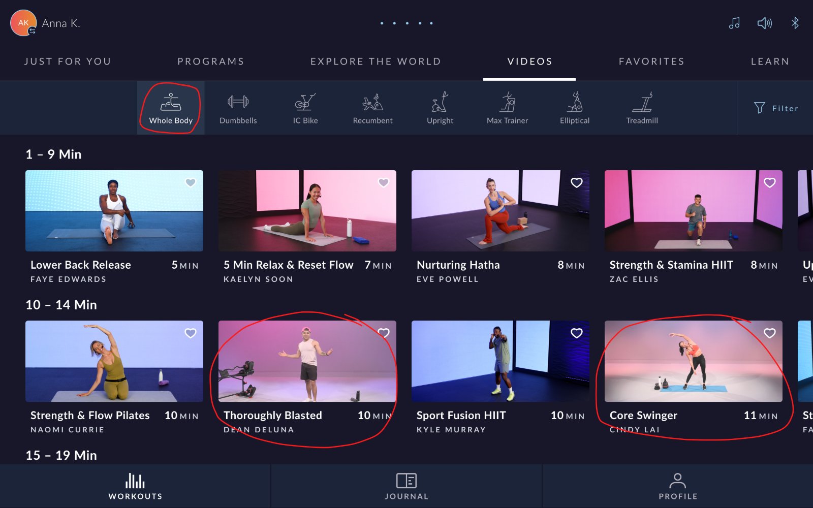
Content was organized inconsistently. Workouts requiring kettlebells, barbells, and some dumbbells were filed under Whole Body, and the Dumbbells tab didn't even contain all of the dumbbell workouts. There was also no way to filter by strength equipment.
Before · Whole Body
After · Weights
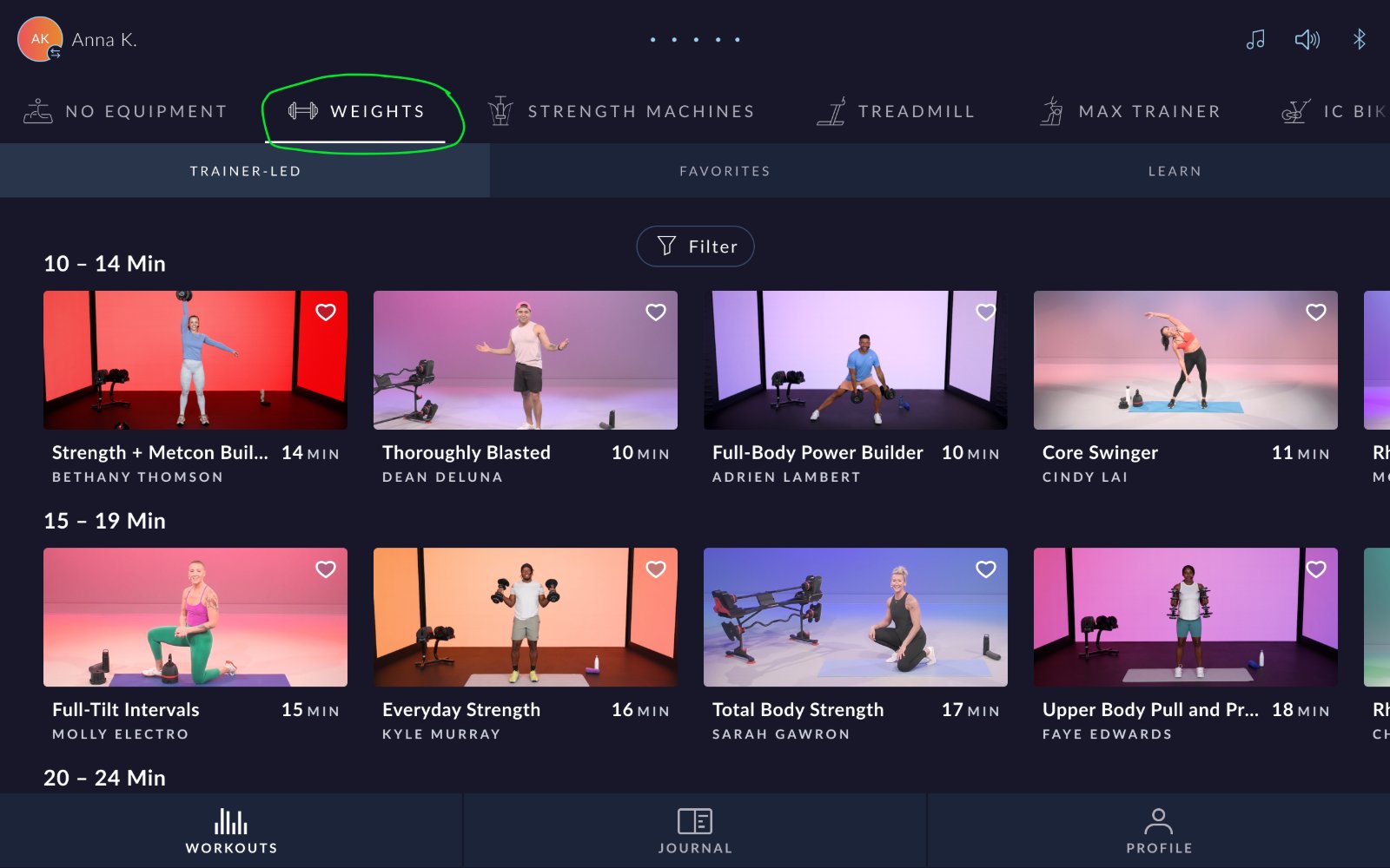
The categories were replaced with two clear ones:
- No Equipment: workouts that don't require anything, like HIIT, Pilates, mobility, and yoga
- Weights: every workout for dumbbells, kettlebells, and barbells, with a new filter for each type of strength equipment
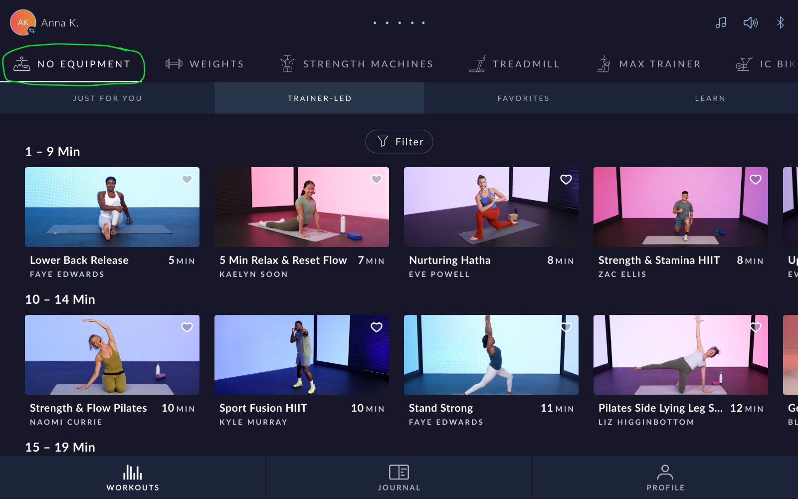
No Equipment
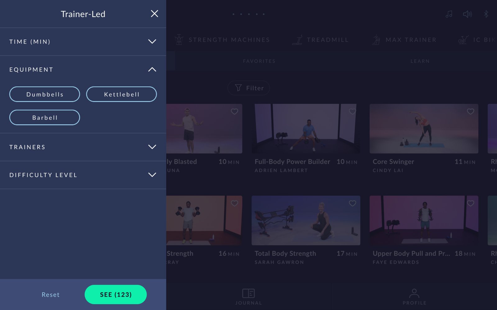
Weights Filter
We also added workouts specific to BowFlex strength machines, which users can filter by individual model. Since the update, Dumbbells has become a more popular filter, a sign that users are finding the equipment-specific content they were looking for.
Simplifying Content Rows
Adaptive workouts,
without the spotlight
Adaptive workouts used to sit in their own dedicated row at the top of the page, above the timed rows. That gave them more emphasis than they needed and added another layer for users to scan before reaching the rest of the content.
To simplify how content is shown, adaptive workouts are now mixed into the timed rows alongside everything else, still marked with their Adaptive tag. Users who want only one kind can filter by adaptive or non-adaptive.
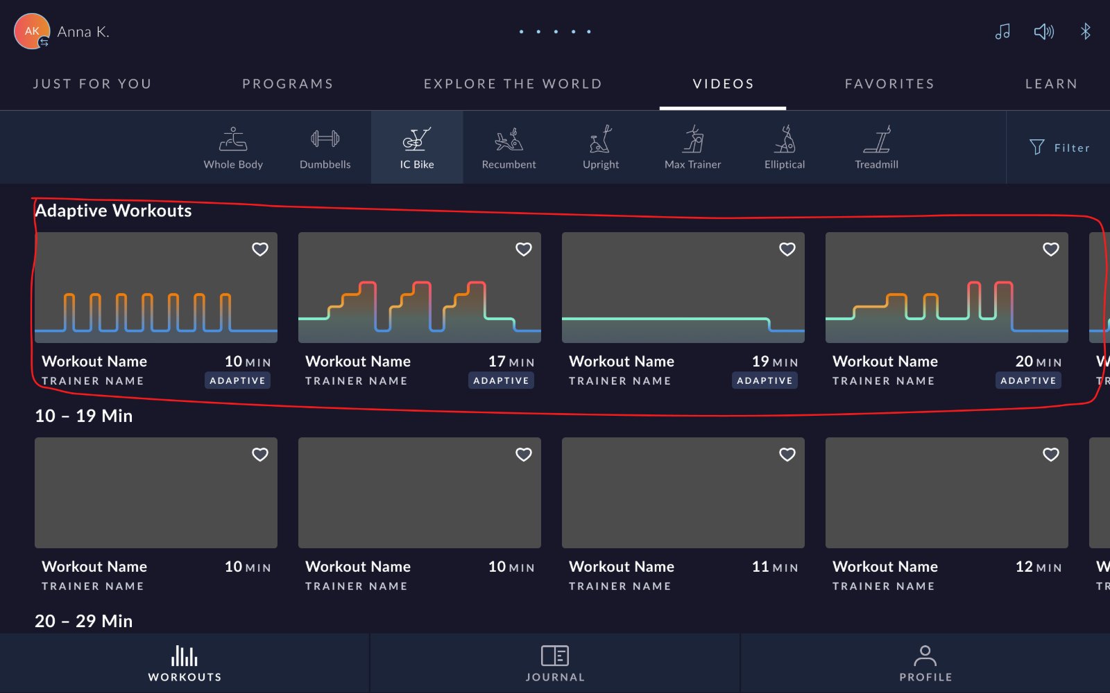
Before · Separate Row
After · Mixed In
Reflection
Structure should follow
the user's decision
Match the mental model, not the content modelThe old navigation reflected how content was produced. The new one reflects how people decide what to do. That one flip resolved several problems at once.
Placement communicates meaningThe filter didn't change, only its position. Moving it next to the content was enough to make its purpose clear, and usage rose as a result.
Labels should describe the experience"Videos" described a format. "Trainer-Led" describes what the workout feels like, which is what users are actually choosing between.
Next Steps